devtools::install_github("wilkelab/ungeviz")Hands-on_Ex04c Visualising Uncertainty
1. Learning Outcome
In this chapter, we will gain hands-on experience on creating statistical graphics for visualising uncertainty of a point statistic or a prediction from a statistical model. By the end of this chapter we will be able:
- to plot statistics error bars by using ggplot2,
- to plot interactive error bars by combining ggplot2, plotly and DT,
- to create advanced visualizations by using ggdist, and
- to create hypothetical outcome plots (HOPs) by using ungeviz package.
2. Getting Started
2.1 Installing and loading the packages
For the purpose of this exercise, the following R packages will be used, they are:
- tidyverse: a family of R packages for data science process,
- plotly: for creating interactive plot,
- gganimate: for creating animation plot,
- DT: for displaying interactive html table,
- crosstalk: for for implementing cross-widget interactions (currently, linked brushing and filtering), and
- ggdist: for visualising distribution and uncertainty.
In order to use gganimate package, we need to obtain the installer from a github repository using devtools.
pacman::p_load(ungeviz, plotly, crosstalk, DT, ggdist, ggridges, colorspace, gganimate, tidyverse)2.2 Data import
The dataset used in this exercise is Exam_data.csv.
exam <- read_csv("../../Data/Exam_data.csv")3. Visualizing the uncertainty of point estimates: ggplot2 methods
A point estimate is a single number, such as a mean. Uncertainty, on the other hand, is expressed as standard error, confidence interval, or credible interval.
In this section, you will learn how to plot error bars of maths scores by race using data provided in exam tibble data frame.
Firstly, code chunk below will be used to derive the necessary summary statistics.
my_sum <- exam %>%
  group_by(RACE) %>%
  summarise(
    n = n(),
    mean = mean(MATHS),
    sd = sd(MATHS)
    ) %>%
  mutate(se = sd / sqrt(n - 1))
Next, the code chunk below will be used to display my_sum tibble data frame in an html table format.
knitr::kable(head(my_sum), format = 'html')| RACE | n | mean | sd | se |
|---|---|---|---|---|
| Chinese | 193 | 76.50777 | 15.69040 | 1.132357 |
| Indian | 12 | 60.66667 | 23.35237 | 7.041005 |
| Malay | 108 | 57.44444 | 21.13478 | 2.043177 |
| Others | 9 | 69.66667 | 10.72381 | 3.791438 |
3.1 Plotting standard error bars of point estimates
Now we are ready to plot the standard error bars of mean maths score by race as shown below.
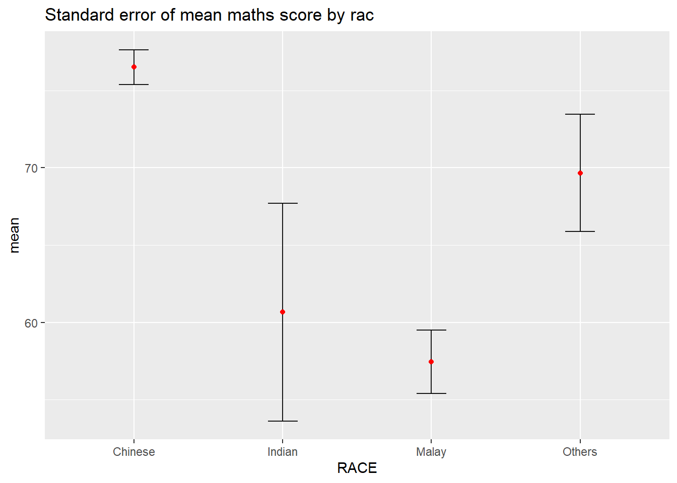
ggplot(my_sum) +
  geom_errorbar(
    aes(x=RACE,
        ymin=mean-se,
        ymax=mean+se),
    width=0.2,
    colour="black",
    alpha=0.9,
    size=0.5) +
  geom_point(aes
           (x=RACE,
            y=mean),
           stat="identity",
           color="red",
           size = 1.5,
           alpha=1) +
  ggtitle("Standard error of mean maths score by rac")
3.2 Plotting confidence interval of point estimates
Instead of plotting the standard error bar of point estimates, we can also plot the confidence intervals of mean maths score by race.
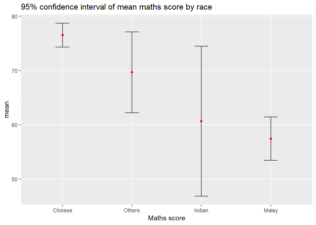
ggplot(my_sum) +
  geom_errorbar(
    aes(x=reorder(RACE, -mean),
        ymin=mean-1.96*se,
        ymax=mean+1.96*se),
    width=0.2,
    colour="black",
    alpha=0.9,
    size=0.5) +
  geom_point(aes
           (x=RACE,
            y=mean),
           stat="identity",
           color="red",
           size = 1.5,
           alpha=1) +
  labs(x = "Maths score",
       title = "95% confidence interval of mean maths score by race")
Try it out
The graph above shows that Chinese students have the highest mean Maths score and Malay students have the lowest mean Maths score. However, the 95% confidence interval for Indian students is the widest among all the races.
3.3 Visualizing the uncertainty of point estimates with interactive error bars
In this section, we will learn how to plot interactive error bars for the 99% confidence interval of mean maths score by race as shown in the figure below.
shared_df = SharedData$new(my_sum)

bscols(widths = c(4, 8),
       ggplotly((ggplot(shared_df) +
                   geom_errorbar(aes(
                     x = reorder(RACE, -mean),
                     ymin = mean - 2.58 * se,
                     ymax = mean + 2.58 * se),
                     width = 0.2,
                     colour = "black",
                     alpha = 0.9,
                     size = 0.5) +
                   geom_point(aes(
                     x = RACE,
                     y = mean,
                     text = paste("Race:", `RACE`,
                                  "<br>N:", `n`,
                                  "<br>Avg. Scores:", round(mean, digits = 2),
                                  "<br>95% CI:[",
                                  round((mean - 2.58 * se), digits = 2), ",",
                                  round((mean + 2.58 * se), digits = 2), "]")),
                     stat = "identity",
                     color = "red",
                     size = 1.5,
                     alpha = 1) +
                   xlab("Race") +
                   ylab("Average Scores") +
                   theme_minimal() +
                   theme(axis.text.x = element_text(
                     angle = 45, vjust = 0.5, hjust = 1)) +
                   ggtitle("99% Confidence interval of average /<br>maths scores by race")),
                tooltip = "text"),
       DT::datatable(shared_df,
                     rownames = FALSE,
                     class = "compact",
                     width = "100%",
                     options = list(pageLength = 10,
                                    scrollX = T),
                     colnames = c("No. of pupils",
                                  "Avg Scores",
                                  "Std Dev",
                                  "Std Error")) %>%
         formatRound(columns = c('mean', 'sd', 'se'),
                     digits = 2))
4. Visualising Uncertainty: ggdist package
ggdist is an R package that provides a flexible set of ggplot2 geoms and stats designed especially for visualising distributions and uncertainty.
It is designed for both frequentist and Bayesian uncertainty visualization, taking the view that uncertainty visualization can be unified through the perspective of distribution visualization:
for frequentist models, one visualises confidence distributions or bootstrap distributions (see vignette(“freq-uncertainty-vis”));
for Bayesian models, one visualises probability distributions (see the tidybayes package, which builds on top of ggdist).
4.1 Visualizing the uncertainty of point estimates: ggdist methods
In the code chunk below, stat_pointinterval() of ggdist is used to build a visual for displaying distribution of maths scores by race.
exam %>%
  ggplot(aes(x = RACE,
             y = MATHS)) +
  stat_pointinterval() +
  labs(
    title = "Visualising confidence intervals of mean math score",
    subtitle = "Mean Point + Multiple-interval plot")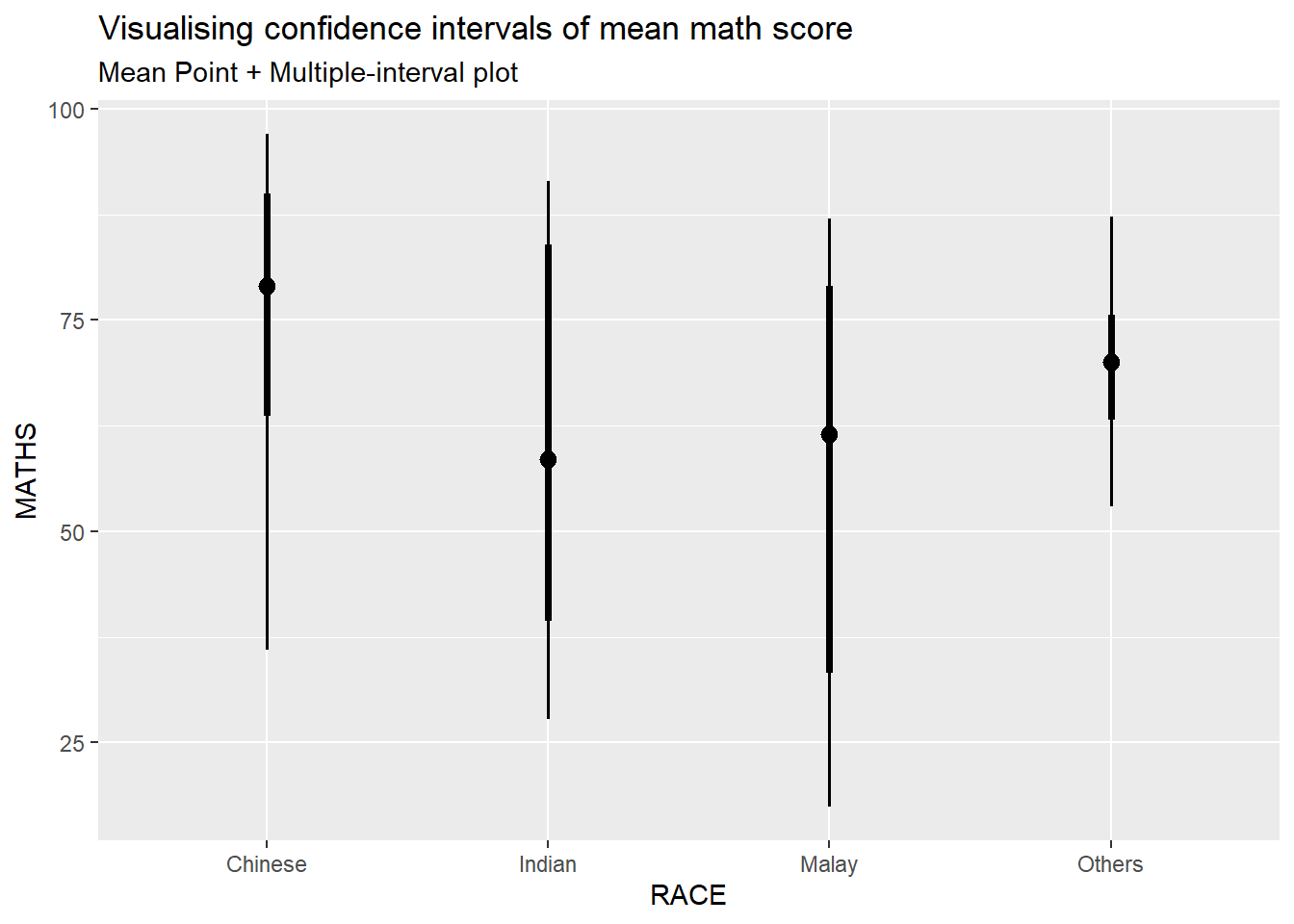
For example, in the code chunk below the following arguments are used:
- .width = 0.95
- .point = median (The default statistic is mean, but we can also change the value of this argument to display median)
- .interval = qi
exam %>%
  ggplot(aes(x = RACE, y = MATHS)) +
  stat_pointinterval(.width = 0.95,
  .point = median,
  .interval = qi) +
  labs(
    title = "Visualising confidence intervals of median math score",
    subtitle = "Median Point + Multiple-interval plot")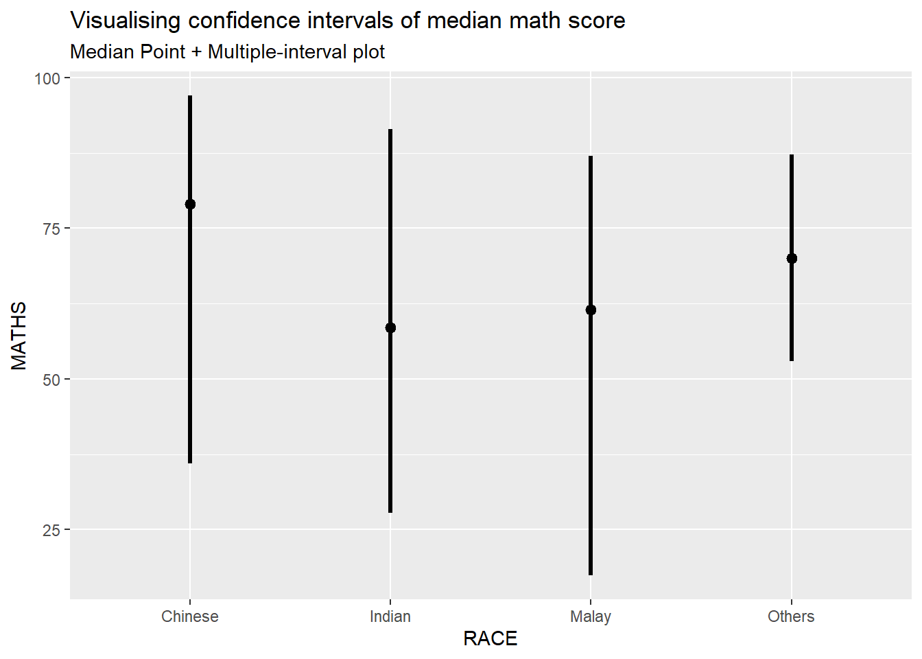
4.2 Visualizing the uncertainty of point estimates: ggdist methods
exam %>%
  ggplot(aes(x = RACE,
             y = MATHS)) +
  stat_pointinterval(
    show.legend = FALSE) +
  labs(
    title = "Visualising confidence intervals of mean math score",
    subtitle = "Mean Point + Multiple-interval plot")
4.3 Visualizing the uncertainty of point estimates: ggdist methods
In the code chunk below, stat_gradientinterval() of ggdist is used to build a visual for displaying distribution of maths scores by race.
exam %>%
  ggplot(aes(x = RACE,
             y = MATHS)) +
  stat_gradientinterval(
    fill = "skyblue",
    show.legend = TRUE
  ) +
  labs(
    title = "Visualising confidence intervals of mean math score",
    subtitle = "Gradient + interval plot")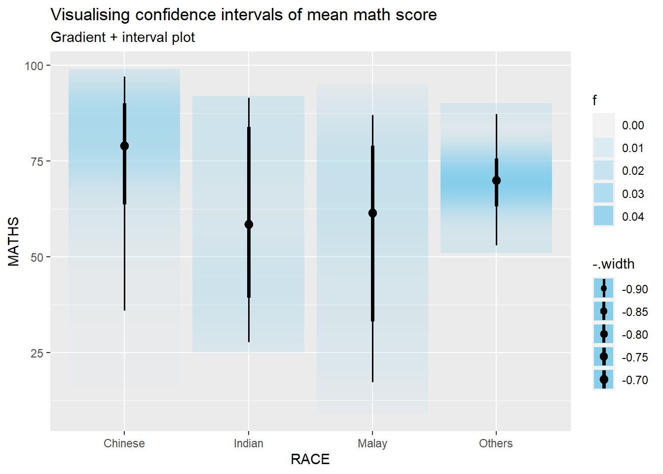
5. Visualising Uncertainty with Hypothetical Outcome Plots (HOPs)
Step 1: Installing ungeviz package
devtools::install_github("wilkelab/ungeviz")As we have done this step at the beginning of this exercise, we’ll skip this step here.
Step 2: Launch the application in R
library(ungeviz)ggplot(data = exam,
(aes(x = factor(RACE), y = MATHS))) +
geom_point(position = position_jitter(
height = 0.3, width = 0.05),
size = 0.4, color = "#0072B2", alpha = 1/2) +
geom_hpline(data = sampler(25, group = RACE), height = 0.6, color = "#D55E00") +
theme_bw() +
# `.draw` is a generated column indicating the sample draw
transition_states(.draw, 1, 3)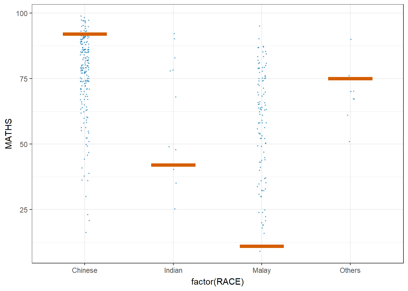
6. Visualising Uncertainty with Hypothetical Outcome Plots (HOPs)
ggplot(data = exam,
       (aes(x = factor(RACE),
            y = MATHS))) +
  geom_point(position = position_jitter(
    height = 0.3,
    width = 0.05),
    size = 0.4,
    color = "#0072B2",
    alpha = 1/2) +
  geom_hpline(data = sampler(25,
                             group = RACE),
              height = 0.6,
              color = "#D55E00") +
  theme_bw() +
  transition_states(.draw, 1, 3)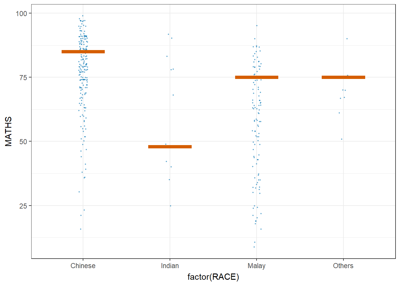
This comes to the end of this hands-on exercise. Hope you enjoyed it, too!
See you in the next hands-on exercise 🥰