pacman::p_load(tidyverse, ggridges, ggdist, ggthemes, colorspace)Visualizing Distribution
1. Learning Outcome
In this hands-on exercise, we will learn another two new ways to visualize the distribution of the data by using ridgeline plot and raincloud plot.
2. Getting Started
2.1 Installing and loading the required libraries
Firstly, let’s install and load the required packages:
tidyverse: an opinionated collection of R packages designed for data import, data wrangling and data exploration
ggridges: a ggplot2 extension specially designed for plotting ridgeline plots
ggdist: to visualise distribution and uncertainty
2.2 Importing the data
Similar to the previous hands-on exercises, we’ll still use Exam_data for this exercise. The data file contains year end examination grades of a cohort of primary 3 students from a local school, and it’s in csv format.
Let’s start by importing the data.
exam <- read_csv("../../Data/Exam_data.csv")3. Visualising Distribution with Ridgeline Plot
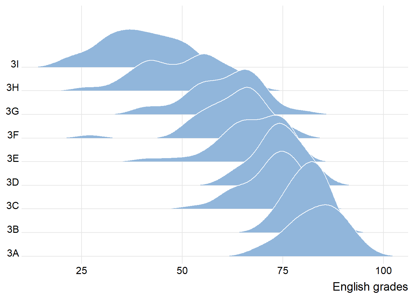
Ridgeline plot, also known as Joyplot, is a type of visualization toview the distribution of a numerical value for several groups. The distribution can be arranged on the same horizontal scale for easy comparison.
Below is an example to compare the distribution of English scores across classes through ridgeline plot.
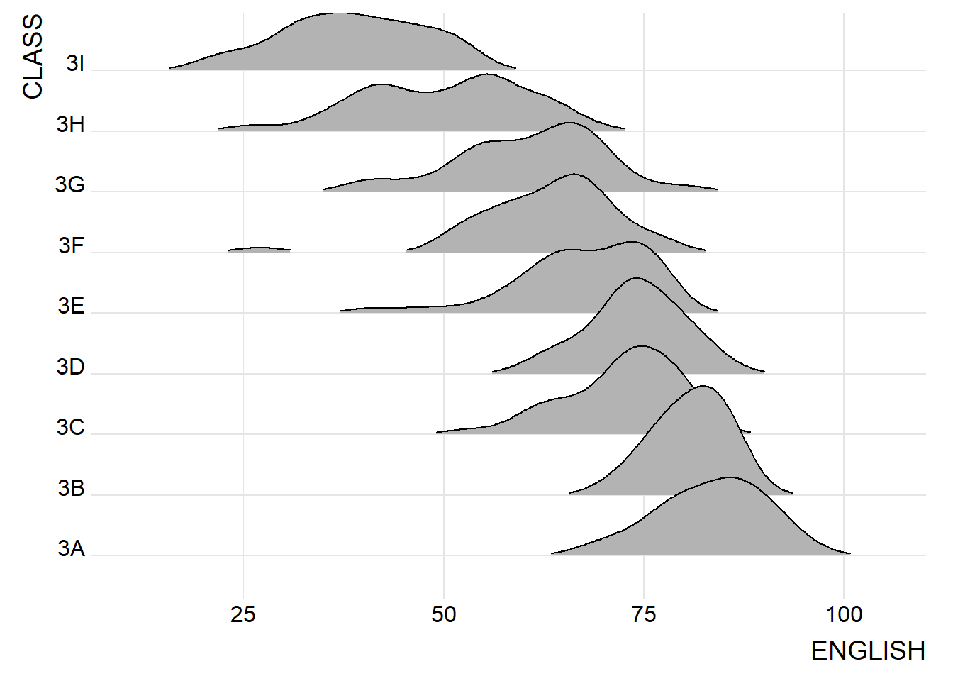
3.1 Plotting ridgeline graph: ggridges method
In this section, we’ll learn to plot ridgeline plot using ggridges package. We’ll mainly use two geoms:
- geom_ridgeline(): takes height values to draw ridgelines
- geom_density_ridges(): estimates data densities and then draw using ridgelines
Let’s look at an example below:
ggplot(exam,
       aes(x = ENGLISH,
           y = CLASS)) +
  geom_density_ridges(
    scale = 3,
    rel_min_height = 0.01,
    bandwidth = 3.4,
    fill = lighten("#7097BB", .3),
    color = "white"
  ) +
  scale_x_continuous(
    name = "English grades",
    expand = c(0, 0)
    ) +
  scale_y_discrete(name = NULL, expand = expansion(add = c(0.2, 2.6))) +
  theme_ridges()
3.2 Varying fill colors along the x axis
The R package also enables us to change the color in the ridgeline plots, by using geom_ridgeline_gradient() or geom_density_ridges_gradient().
Let’s look at an example below:
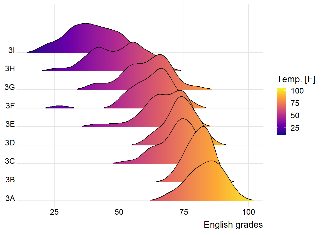
ggplot(exam,
       aes(x = ENGLISH,
           y = CLASS,
           fill = after_stat(x))) +
  geom_density_ridges_gradient(
    scale = 3,
    rel_min_height = 0.01) +
  scale_fill_viridis_c(name = "Temp. [F]",
                       option = "C") +
  scale_x_continuous(
    name = "English grades",
    expand = c(0, 0)
  ) +
  scale_y_discrete(name = NULL, expand = expansion(add = c(0.2, 2.6))) +
  theme_ridges()
3.3 Mapping the probabilities directly onto colour
Beside providing additional geom objects to support the need to plot ridgeline plot, ggridges package also provides a stat function called stat_density_ridges() that replaces stat_density() of ggplot2.
Figure below is plotted by mapping the probabilities calculated by using stat(ecdf) which represent the empirical cumulative density function for the distribution of English score.
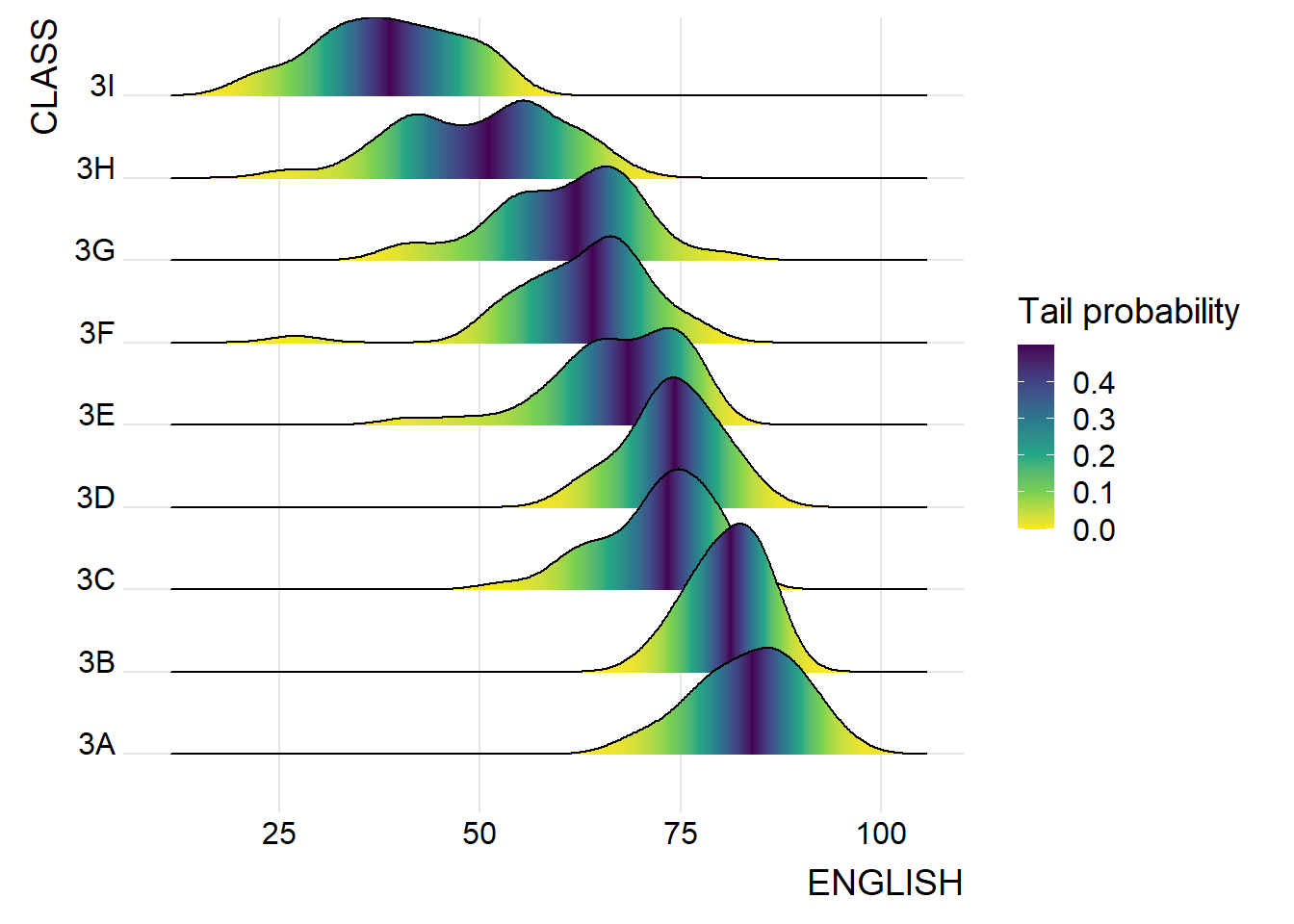
ggplot(exam,
       aes(x = ENGLISH,
           y = CLASS,
           fill = 0.5 - abs(0.5 - stat(ecdf)))) +
  stat_density_ridges(geom = "density_ridges_gradient",
                      calc_ecdf = TRUE) +
  scale_fill_viridis_c(name = "Tail probability",
                       direction = -1) +
  theme_ridges()
3.4 Ridgeline plots with quantile lines
By using geom_density_ridges_gradient(), we can colour the ridgeline plot by quantile, via the calculated stat(quantile) aesthetic as shown in the figure below.
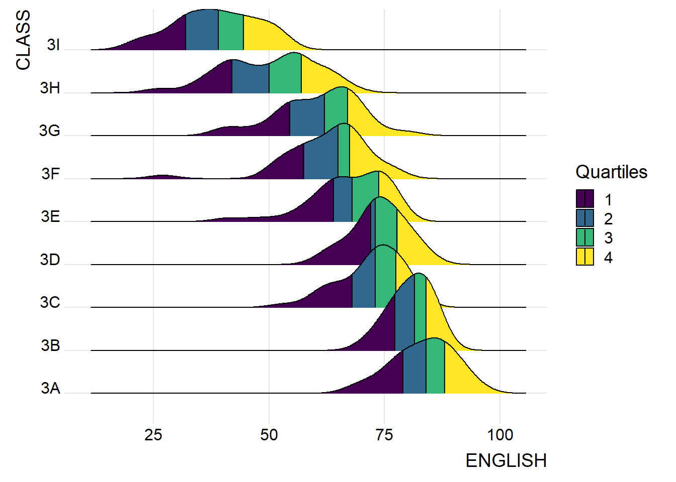
ggplot(exam,
       aes(x = ENGLISH,
           y = CLASS,
           fill = factor(stat(quantile))
           )) +
  stat_density_ridges(
    geom = "density_ridges_gradient",
    calc_ecdf = TRUE,
    quantiles = 4,
    quantile_lines = TRUE) +
  scale_fill_viridis_d(name = "Quartiles") +
  theme_ridges()
Instead of using number to define the quantiles, we can also specify quantiles by cut points such as 2.5% and 97.5% tails to colour the ridgeline plot as shown in the figure below.
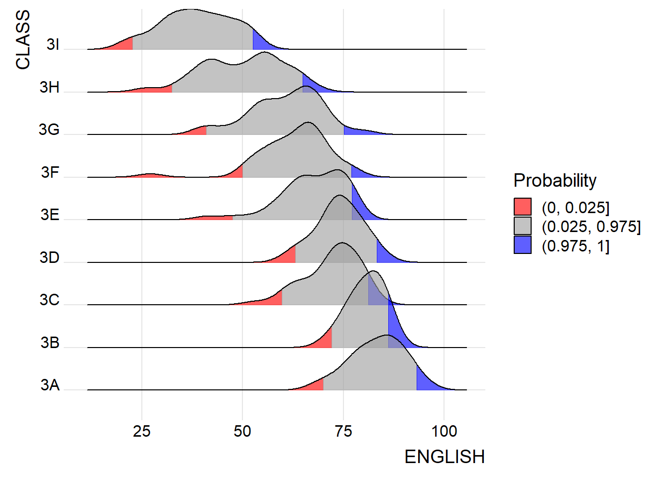
ggplot(exam,
aes(x = ENGLISH,
y = CLASS,
fill = factor(stat(quantile))
)) +
stat_density_ridges(
geom = "density_ridges_gradient",
calc_ecdf = TRUE,
quantiles = c(0.025, 0.975)
) +
scale_fill_manual(
name = "Probability",
values = c("#FF0000A0", "#A0A0A0A0", "#0000FFA0"),
labels = c("(0, 0.025]", "(0.025, 0.975]", "(0.975, 1]")
) +
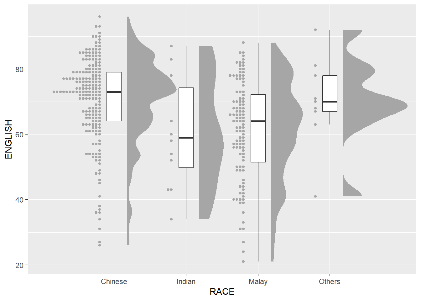
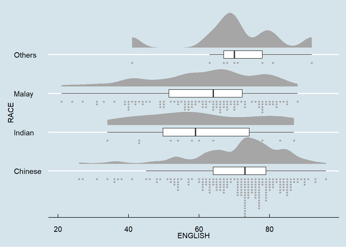
theme_ridges()4. Visualising Distribution with Raincloud Plot
In this section, we will learn how to create a raincloud plot to visualise the distribution of English score by race. It will be created by using functions provided by ggdist and ggplot2 packages.
4.1 Plotting a Half Eye graph
First, we will plot a Half-Eye graph by using stat_halfeye() of ggdist package.
This produces a Half Eye visualization, which is contains a half-density and a slab-interval.
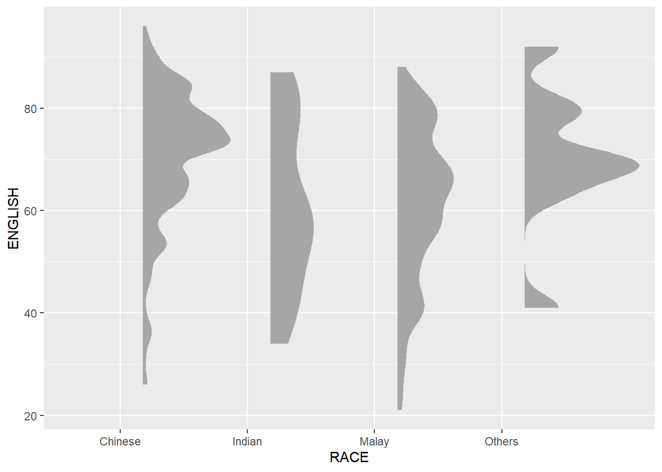
ggplot(exam,
       aes(x = RACE,
           y = ENGLISH)) +
  stat_halfeye(adjust = 0.5,
               justification = -0.2,
               .width = 0,
               point_colour = NA)
4.2 Adding the boxplot with geom_boxplot()
Next, we will add the second geometry layer using geom_boxplot() of ggplot2. This produces a narrow boxplot. We reduce the width and adjust the opacity.
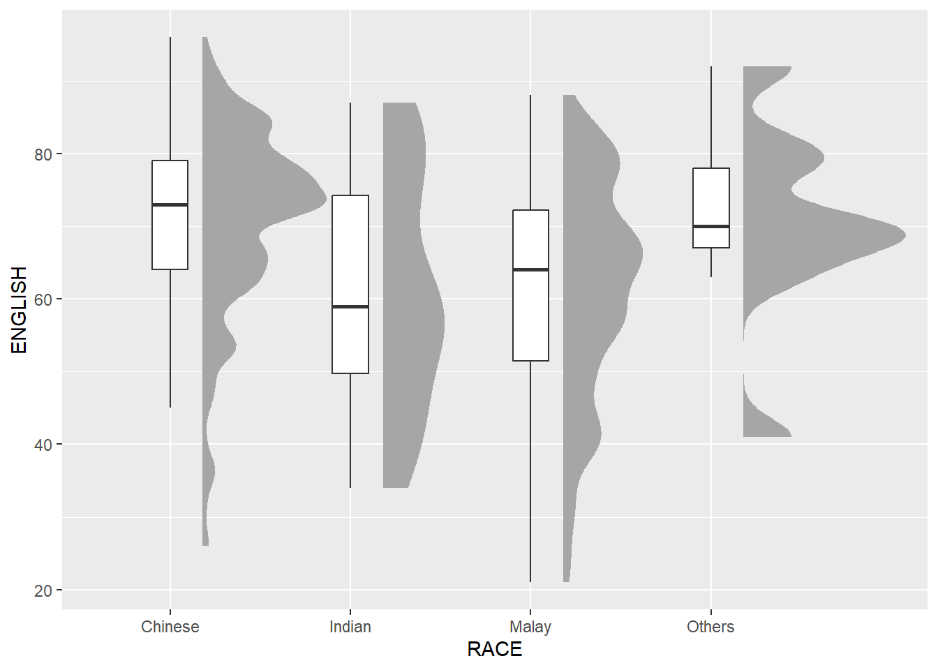
ggplot(exam,
       aes(x = RACE,
           y = ENGLISH)) +
  stat_halfeye(adjust = 0.5,
               justification = -0.2,
               .width = 0,
               point_colour = NA) +
  geom_boxplot(width = .20,
               outlier.shape = NA)
4.3 Adding the Dot Plots with stat_dots()
Next, we will add the third geometry layer using stat_dots() of ggdist package. This produces a half-dotplot, which is similar to a histogram that indicates the number of samples (number of dots) in each bin. We select side = “left” to indicate we want it on the left-hand side.
ggplot(exam,
       aes(x = RACE,
           y = ENGLISH)) +
  stat_halfeye(adjust = 0.5,
               justification = -0.2,
               .width = 0,
               point_colour = NA) +
  geom_boxplot(width = .20,
               outlier.shape = NA) +
  stat_dots(side = "left",
            justification = 1.2,
            binwidth = 0.5,
            dotsize = 2)
4.4 Finishing touch
Lastly, coord_flip() of ggplot2 package will be used to flip the raincloud chart horizontally to give it the raincloud appearance. At the same time, theme_economist() of ggthemes package is used to give the raincloud chart a professional publishing standard look.
ggplot(exam,
       aes(x = RACE,
           y = ENGLISH)) +
  stat_halfeye(adjust = 0.5,
               justification = -0.2,
               .width = 0,
               point_colour = NA) +
  geom_boxplot(width = 0.20,
               outlier.shape = NA) +
  stat_dots(side = "left",
            justification = 1.2,
            binwidth = 0.5,
            dotsize = 1.5) +
  coord_flip() +
  theme_economist()
This comes to the end of this hands-on exercise. I have learned to create ridgeline plots and raincloud plots in R. Hope you enjoyed it, too!
See you in the next hands-on exercise 🥰