pacman::p_load(tidyverse, ggstatsplot)Visual Statistical Analysis
1. Learning Outcome
In this hands-on exercise, we will learn the following:
ggstatsplot package to create visual graphics with rich statistical information,
performance package to visualise model diagnostics, and
parameters package to visualise model parameters
2. Getting Started
2.1 Installing and loading the required libraries
Firstly, let’s install and load the required packages:
tidyverse: an opinionated collection of R packages designed for data import, data wrangling and data exploration
ggstatsplot: an extension of ggplot2 package for creating graphics with details from statistical tests included in the information-rich plots themselves
2.2 Importing the data
Similar to the previous hands-on exercises, we’ll still use Exam_data for this exercise. The data file contains year end examination grades of a cohort of primary 3 students from a local school, and it’s in csv format.
Let’s start by importing the data.
exam <- read_csv("../../Data/Exam_data.csv")3. One-sample test: gghistostats() method
In the code chunk below, gghistostats() is used to to build an visual of one-sample test on English scores.
set.seed(1234)

gghistostats(
  data = exam,
  x = ENGLISH,
  type = "bayes",
  test.value = 60,
  xlab = "English scores"
)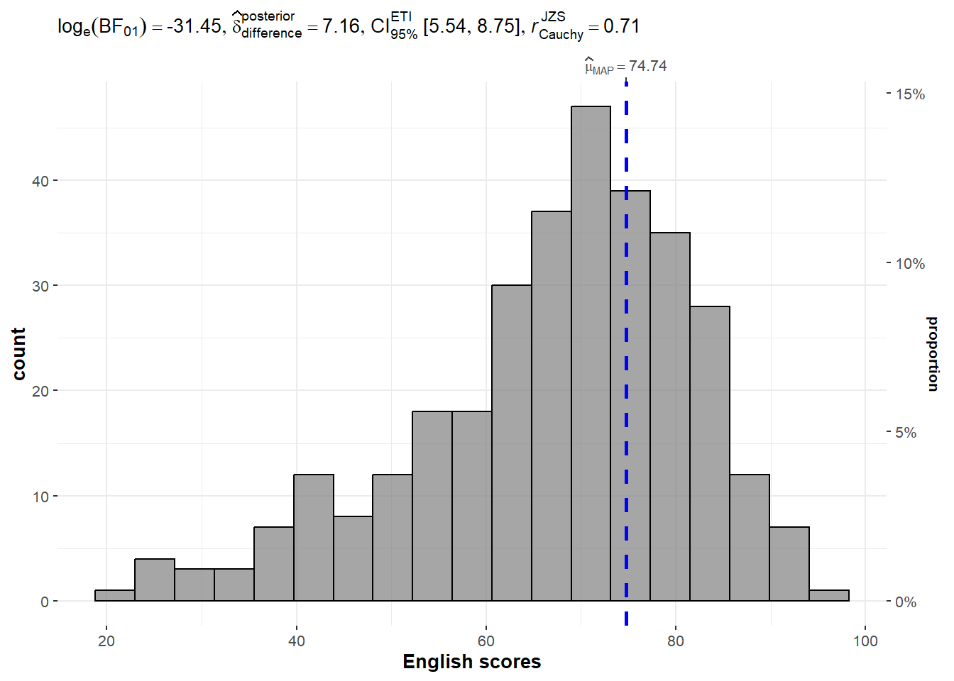
Default information: - statistical details - Bayes Factor - sample sizes - distribution summary
3.1 Unpacking the Bayes Factor
A Bayes factor is the ratio of the likelihood of one particular hypothesis to the likelihood of another. It can be interpreted as a measure of the strength of evidence in favor of one theory among two competing theories.
That’s because the Bayes factor gives us a way to evaluate the data in favor of a null hypothesis, and to use external information to do so. It tells us what the weight of the evidence is in favor of a given hypothesis.
When we are comparing two hypotheses, H1 (the alternate hypothesis) and H0 (the null hypothesis), the Bayes Factor is often written as B10.
The Schwarz criterion is one of the easiest ways to calculate rough approximation of the Bayes Factor.
3.2 How to interpret Bayes Factor
A Bayes Factor can be any positive number. One of the most common interpretations is this one—first proposed by Harold Jeffereys (1961) and slightly modified by Lee and Wagenmakers in 2013.
4. Two-sample mean test: ggbetweenstats()
In the code chunk below, ggbetweenstats() is used to build a visual for two-sample mean test of Maths scores by gender.
ggbetweenstats(
  data = exam,
  x = GENDER,
  y = MATHS,
  type = "np",
  messages = FALSE
)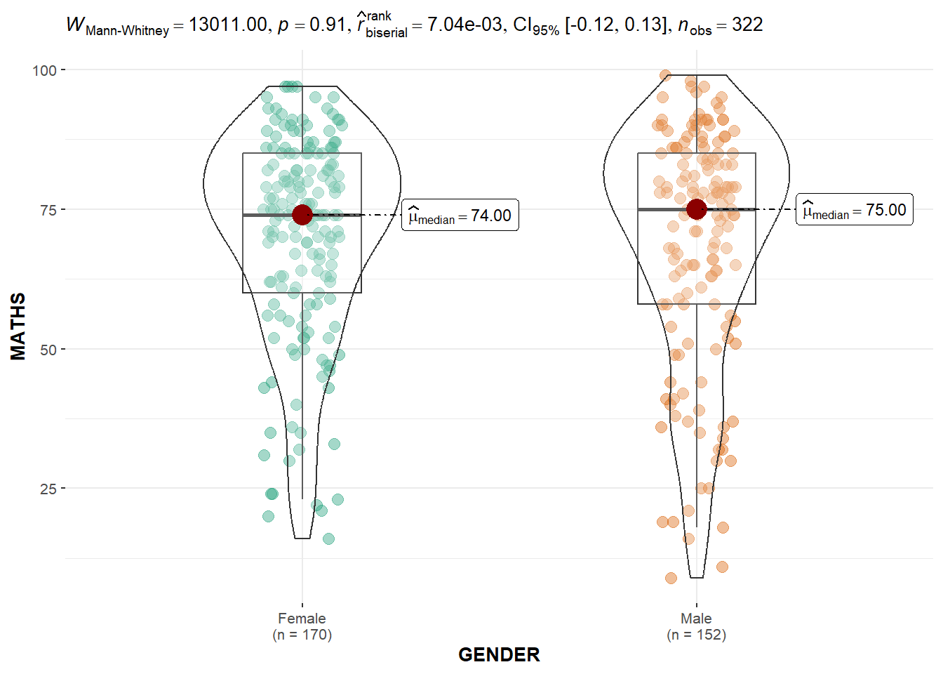
Default information: - statistical details - Bayes Factor - sample sizes - distribution summary
Try it out
The Mann-Whitney statistic is displayed on the plot to tell if the two distributions are significantly different. Since the p-value is larger than 0.05, we can conclude that the maths scores between female students and male students are not significantly different at 5% significance level.
5. Oneway ANOVA Test: ggbetweenstats() method
In the code chunk below, ggbetweenstats() is used to build a visual for One-way ANOVA test on English score by race.
ggbetweenstats(
  data = exam,
  x = RACE,
  y = ENGLISH,
  type = "p",
  mean.ci = TRUE,
  pairwise.comparisons = TRUE,
  pairwise.display = "s",
  p.adjust.method = "fdr",
  messages = FALSE
)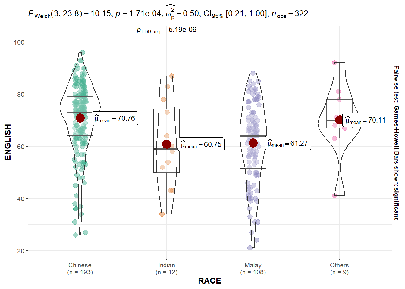
A few values that we can choose for pairwise.display: - “ns” → only non-significant - “s” → only significant - “all” → everything
Try it out
Welch test is performed to check if the English scores varies among different races significantly. Since the p-value is less than 0.05, we can conclude that the English scores distributed significantly different among races at 5% significance level.
6. Significant Test of Correlation: ggscatterstats()
In the code chunk below, ggscatterstats() is used to build a visual for Significant Test of Correlation between Maths scores and English scores.
ggscatterstats(
  data = exam,
  x = MATHS,
  y = ENGLISH,
  marginal = FALSE,
  )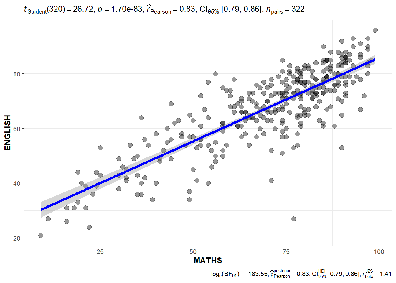
Try it out
The plot above shows that there is a strong positive correlation between English scores and Maths scores, as the Pearson correlation coefficient is 0.83.
7. Significant Test of Association (Depedence) : ggbarstats() methods
In the code chunk below, the Maths scores is binned into a 4-class variable by using cut().
exam1 <- exam %>%
  mutate(MATHS_bins =
           cut(MATHS,
               breaks = c(0,60,75,85,100))
)
In this code chunk below ggbarstats() is used to build a visual for Significant Test of Association.
ggbarstats(exam1,
           x = MATHS_bins,
           y = GENDER)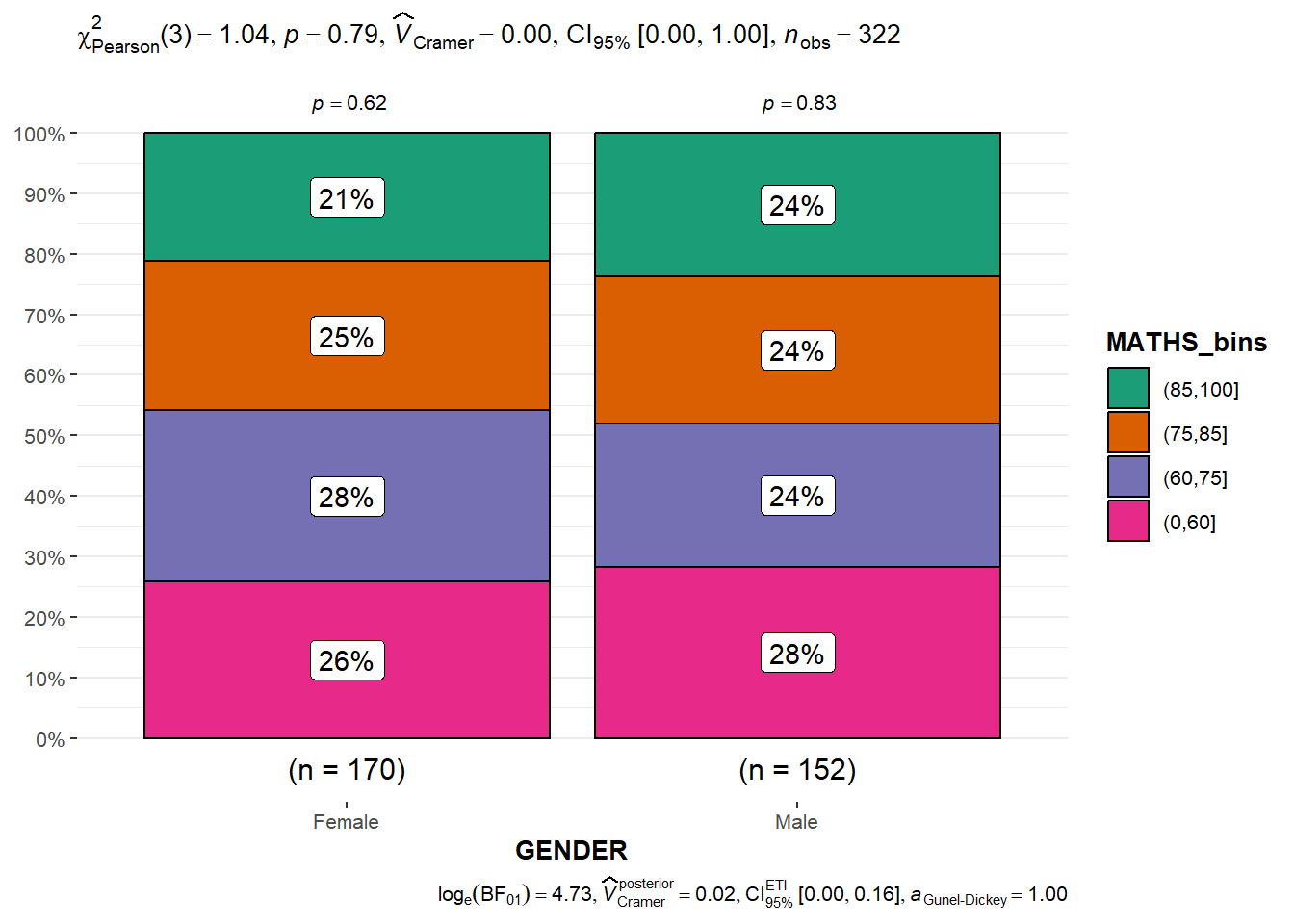
8. Visualising Models
In this section, we will learn how to visualise model diagnostic and model parameters by using parameters package.
- Toyota Corolla case study will be used. The purpose of study is to build a model to discover factors affecting prices of used-cars by taking into consideration a set of explanatory variables.
8.1 Installing and loading the required libraries
In this exercise, ggstatsplot and tidyverse will be used.
pacman::p_load(readxl, performance, parameters, see, ggstatsplot, tidyverse)8.2 Importing Excel file: readxl methods
Let’s first import the data using read_xls() function from readxl package. In this exercise, we’ll use the data worksheet of ToyotaCorolla.xls workbook.
car_resale <- read_xls("../../Data/ToyotaCorolla.xls", "data")

car_resale
# A tibble: 1,436 × 38
Id Model Price Age_08_04 Mfg_Month Mfg_Year KM Quarterly_Tax Weight
<dbl> <chr> <dbl> <dbl> <dbl> <dbl> <dbl> <dbl> <dbl>
1 81 TOYOTA … 18950 25 8 2002 20019 100 1180
2 1 TOYOTA … 13500 23 10 2002 46986 210 1165
3 2 TOYOTA … 13750 23 10 2002 72937 210 1165
4 3 TOYOTA… 13950 24 9 2002 41711 210 1165
5 4 TOYOTA … 14950 26 7 2002 48000 210 1165
6 5 TOYOTA … 13750 30 3 2002 38500 210 1170
7 6 TOYOTA … 12950 32 1 2002 61000 210 1170
8 7 TOYOTA… 16900 27 6 2002 94612 210 1245
9 8 TOYOTA … 18600 30 3 2002 75889 210 1245
10 44 TOYOTA … 16950 27 6 2002 110404 234 1255
# ℹ 1,426 more rows
# ℹ 29 more variables: Guarantee_Period <dbl>, HP_Bin <chr>, CC_bin <chr>,
# Doors <dbl>, Gears <dbl>, Cylinders <dbl>, Fuel_Type <chr>, Color <chr>,
# Met_Color <dbl>, Automatic <dbl>, Mfr_Guarantee <dbl>,
# BOVAG_Guarantee <dbl>, ABS <dbl>, Airbag_1 <dbl>, Airbag_2 <dbl>,
# Airco <dbl>, Automatic_airco <dbl>, Boardcomputer <dbl>, CD_Player <dbl>,
# Central_Lock <dbl>, Powered_Windows <dbl>, Power_Steering <dbl>, …
Try it out
The data is imported as a tibble table in R. There are 1,436 rows, and 38 columns in the dataset.
- 5 categorical variables
- 33 numerical variables
8.3 Multiple Regression Model using lm()
The code chunk below is used to calibrate a multiple linear regression model by using lm() of Base Stats of R.
model <- lm(Price ~ Age_08_04 + Mfg_Year + KM + Weight + Guarantee_Period,
            data = car_resale)

model
Call:
lm(formula = Price ~ Age_08_04 + Mfg_Year + KM + Weight + Guarantee_Period,
    data = car_resale)

Coefficients:
     (Intercept)         Age_08_04          Mfg_Year                KM
      -2.637e+06        -1.409e+01         1.315e+03        -2.323e-02
          Weight  Guarantee_Period
       1.903e+01         2.770e+01
Try it out
The results above provides the intercept of the model and the coefficients of the factors.
- intercept: -2.637e+06
- Age_08_04: -1.409e+01
- Mfg_Year: 1.315e+03
- KM: -2.323e-02
- Weight: 1.903e+01
- Guarantee_Period: 2.770e+01
8.4 Model Diagnostic: checking for multicolinearity:
In the code chunk, check_collinearity() of performance package is used to check if multicolinearity exists in the model.
check_collinearity(model)# Check for Multicollinearity
Low Correlation
Term VIF VIF 95% CI Increased SE Tolerance Tolerance 95% CI
KM 1.46 [ 1.37, 1.57] 1.21 0.68 [0.64, 0.73]
Weight 1.41 [ 1.32, 1.51] 1.19 0.71 [0.66, 0.76]
Guarantee_Period 1.04 [ 1.01, 1.17] 1.02 0.97 [0.86, 0.99]
High Correlation
Term VIF VIF 95% CI Increased SE Tolerance Tolerance 95% CI
Age_08_04 31.07 [28.08, 34.38] 5.57 0.03 [0.03, 0.04]
Mfg_Year 31.16 [28.16, 34.48] 5.58 0.03 [0.03, 0.04]
Try it out
The results above shows that Age_08_04 and Mfg_Year is highly correlated as the VIF value is larger than 10.
In this case, we shall remove one of them and retrain the model.
check_c <- check_collinearity(model)
plot(check_c)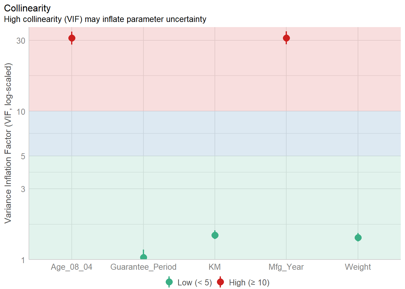
8.5 Model Diagnostic: checking normality assumption
Let’s remove the manufacturing year and retrain the model.
model1 <- lm(Price ~ Age_08_04 + KM + Weight + Guarantee_Period,
             data = car_resale)
In the code chunk, check_normality() of performance package is used to check if the residuals of the model follows the normal distribution.
check_n <- check_normality(model1)plot(check_n)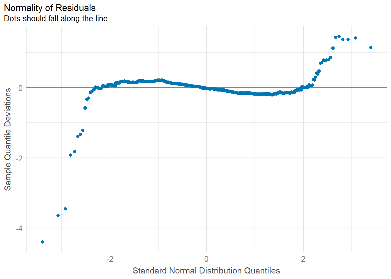
Try it out
The plot above shows that some residuals are not along the 0 reference line, which indicates that the residuals are not normally distributed.
8.6 Model Diagnostic: Check model for homogeneity of variances
In the code chunk, check_heteroscedasticity() of performance package is used to check for homogeneity of variance.
check_h <- check_heteroscedasticity(model1)plot(check_h)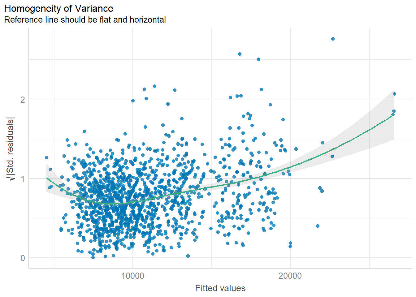
Try it out
As the reference line shows an upward trend, it indicates that heterogeneity exists in the residuals.
8.7 Model Diagnostic: Complete check
We can also perform the complete checkings by using check_model() function.
check_model(model1)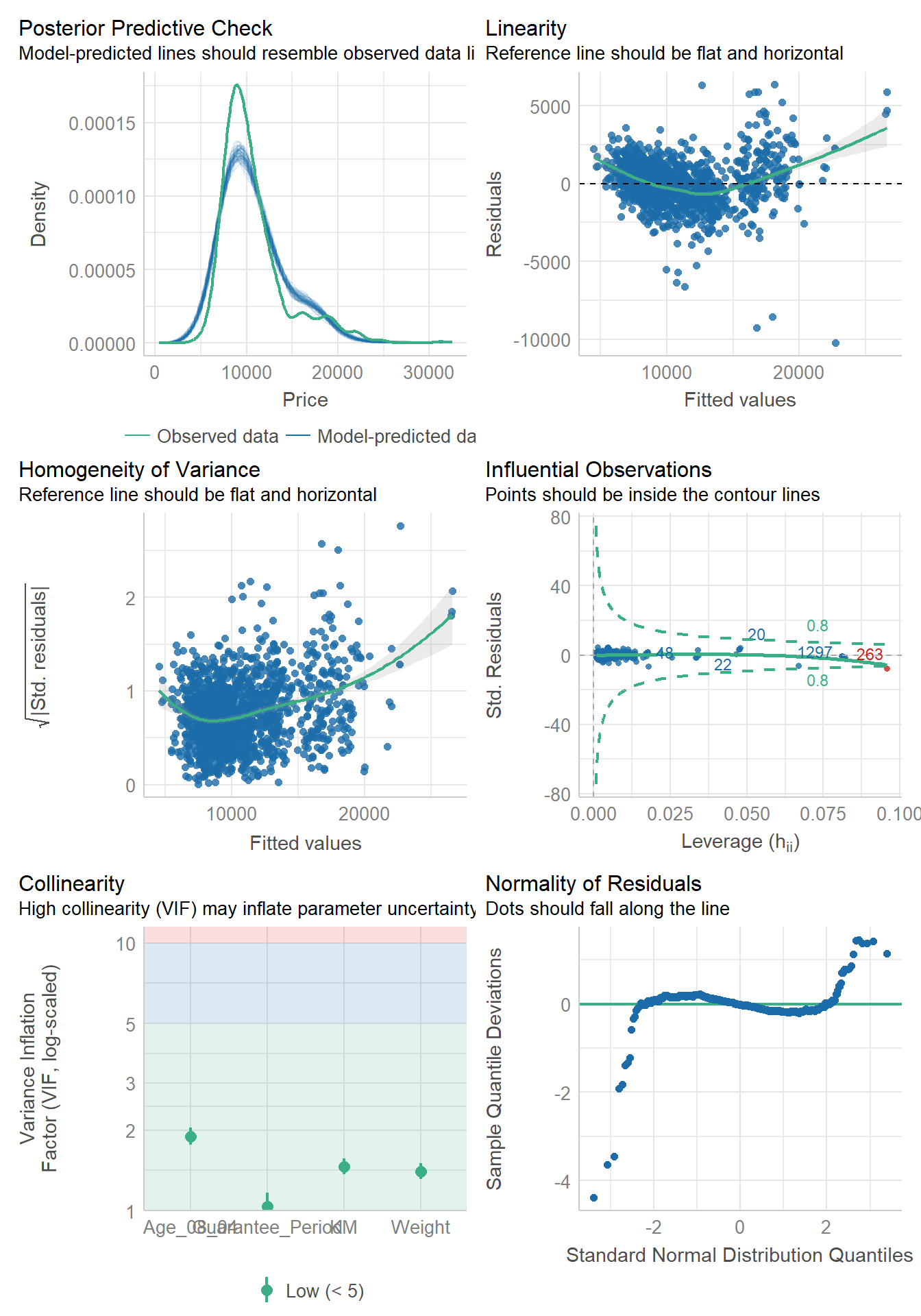
8.8 Visualising Regression Parameters: see methods
In the code below, plot() of see package and parameters() of parameters package is used to visualise the parameters of a regression model.
plot(parameters(model1))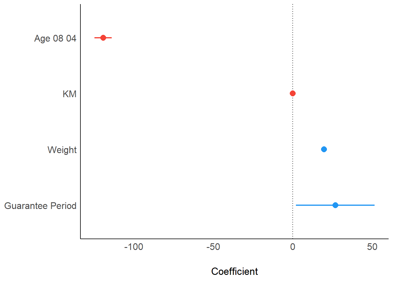
Try it out
It’s clear from the plot above that Age_08_04 and KM have negative impact on the price, whereas weight and guarantee period have positive impact on the price.
A factor with a negative impact indicates that the higher the value is, the lower the price is. On the other hand, a factor with a postive impact indicates that the higher the values is, the higher the price is.
8.9 Visualising Regression Parameters: ggcoefstats() methods
In the code below, ggcoefstats() of ggstatsplot package to visualise the parameters of a regression model.
ggcoefstats(model1,
            output = "plot")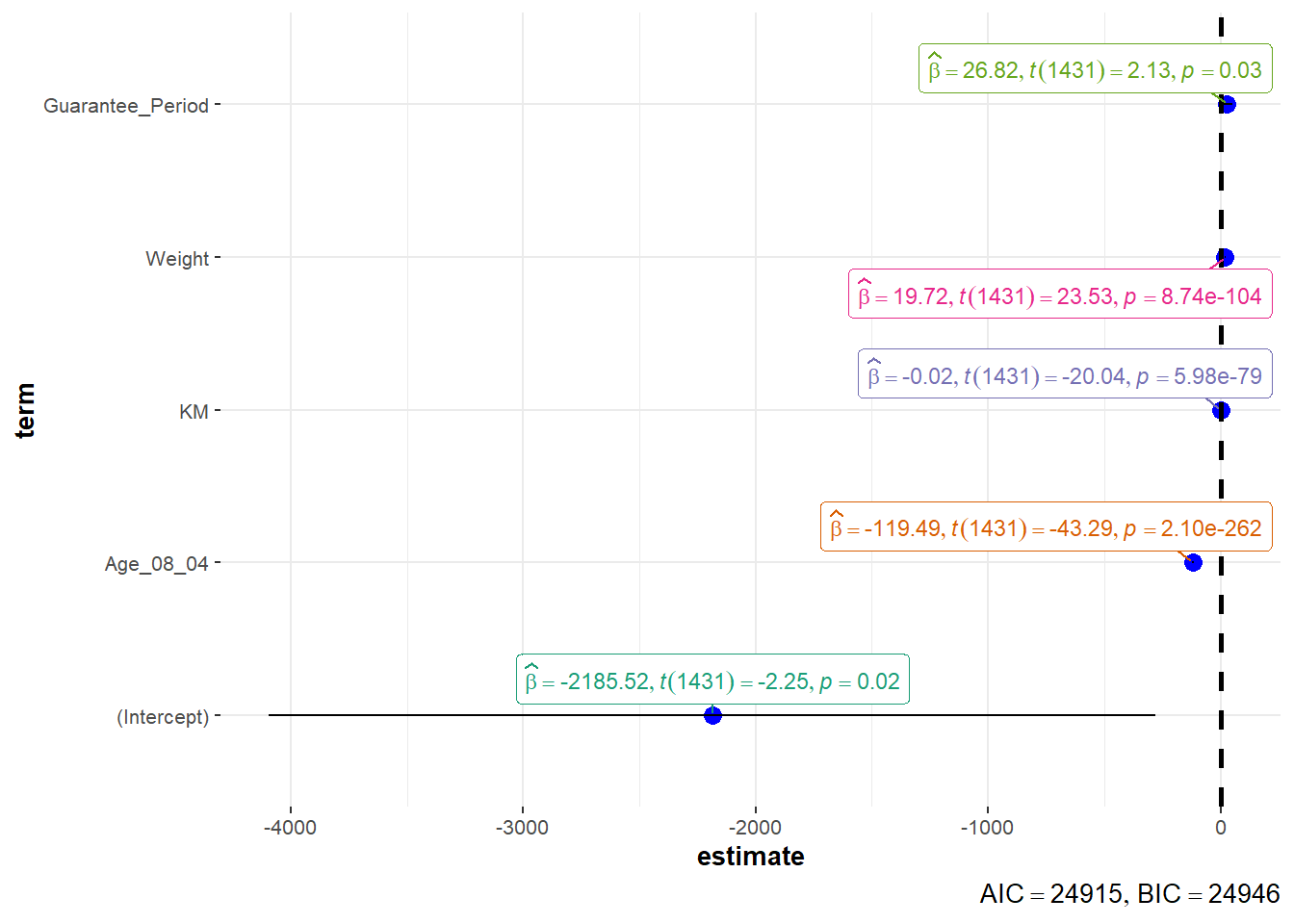
This comes to the end of this hands-on exercise. Hope you enjoyed it, too!
See you in the next hands-on exercise 🥰