pacman::p_load(tidyverse, treemap, treemapify)Treemap Visualisation with R
1. Learning Outcome
In this hands-on exercise, we will learn how to design treemap using appropriate R packages.
2. Getting Started
2.1 Installing and loading the required libraries
Firstly, let’s install and load the required packages:
tidyverse: an opinionated collection of R packages designed for data import, data wrangling and data exploration
treemap: offers great flexibility to draw treemaps.
treemapify: a ggplot2 extension to draw treemaps.
2.2 Importing the data
In this exercise, REALIS2018.csv data will be used. This dataset provides information of private property transaction records in 2018. The dataset is extracted from REALIS portal of Urban Redevelopment Authority (URA).
Let’s start by importing the data.
realis2018 <- read_csv("../../Data/realis2018.csv")The data contains 156 rows and 12 columns:
- 12 character variables
- 8 numerical variables
2.3 Preparing the data
To prepare the data for treemaps, we need to transform the data in the following ways:
group transaction records by Project Name, Planning Region, Planning Area, Property Type and Type of Sale
compute Total Unit Sold, Total Area, Median Unit Price and Median Transacted Price by applying appropriate summary statistics on No. of Units, Area (sqm), Unit Price ($ psm) and Transacted Price ($) respectively.
realis2018_summarised <- realis2018 %>%
  group_by(`Project Name`,
           `Planning Region`,
           `Planning Area`,
           `Property Type`,
           `Type of Sale`) %>%
  summarise(`Total Unit Sold` = sum(`No. of Units`, na.rm = TRUE),
            `Total Area` = sum(`Area (sqm)`, na.rm = TRUE),
            `Median Unit Price ($ psm)` = median(`Unit Price ($ psm)`, na.rm = TRUE),
            `Median Transacted Price` = median(`Transacted Price ($)`, na.rm = TRUE))
3. Designing Treemap with treemap Package
In this section, we will only explore the major arguments for designing elegant and yet truthful treemaps.
3.1 Designing a static treemap
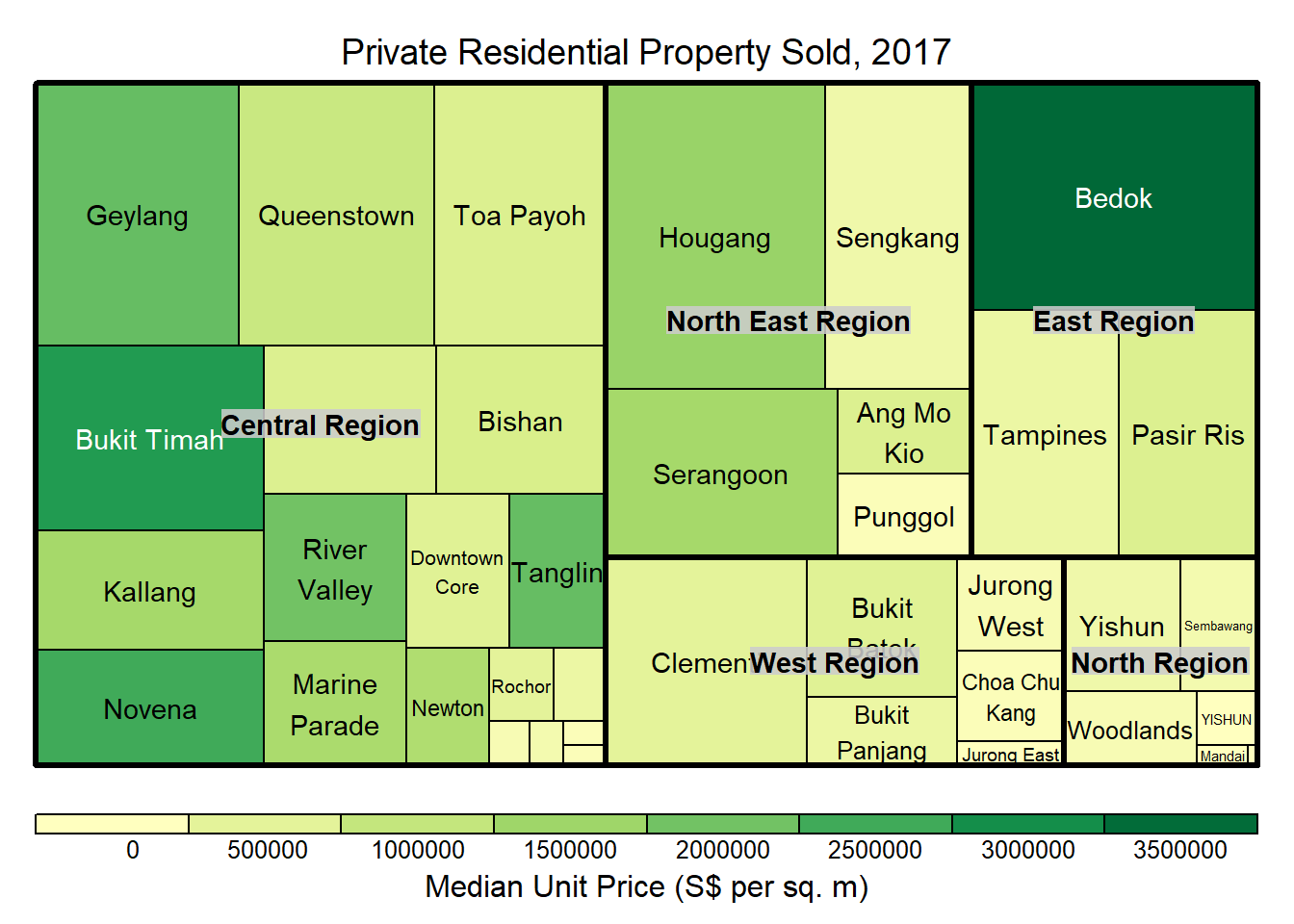
In this section, treemap() of Treemap package is used to plot a treemap showing the distribution of median unit prices and total unit sold of resale condominium by geographic hierarchy in 2017.
First, we will select records belongs to resale condominium property type from realis2018_selected data frame.
realis2018_selected <- realis2018_summarised %>%
  filter(`Property Type` == "Condominium", `Type of Sale` == "Resale")
3.2 Using the basic arguments
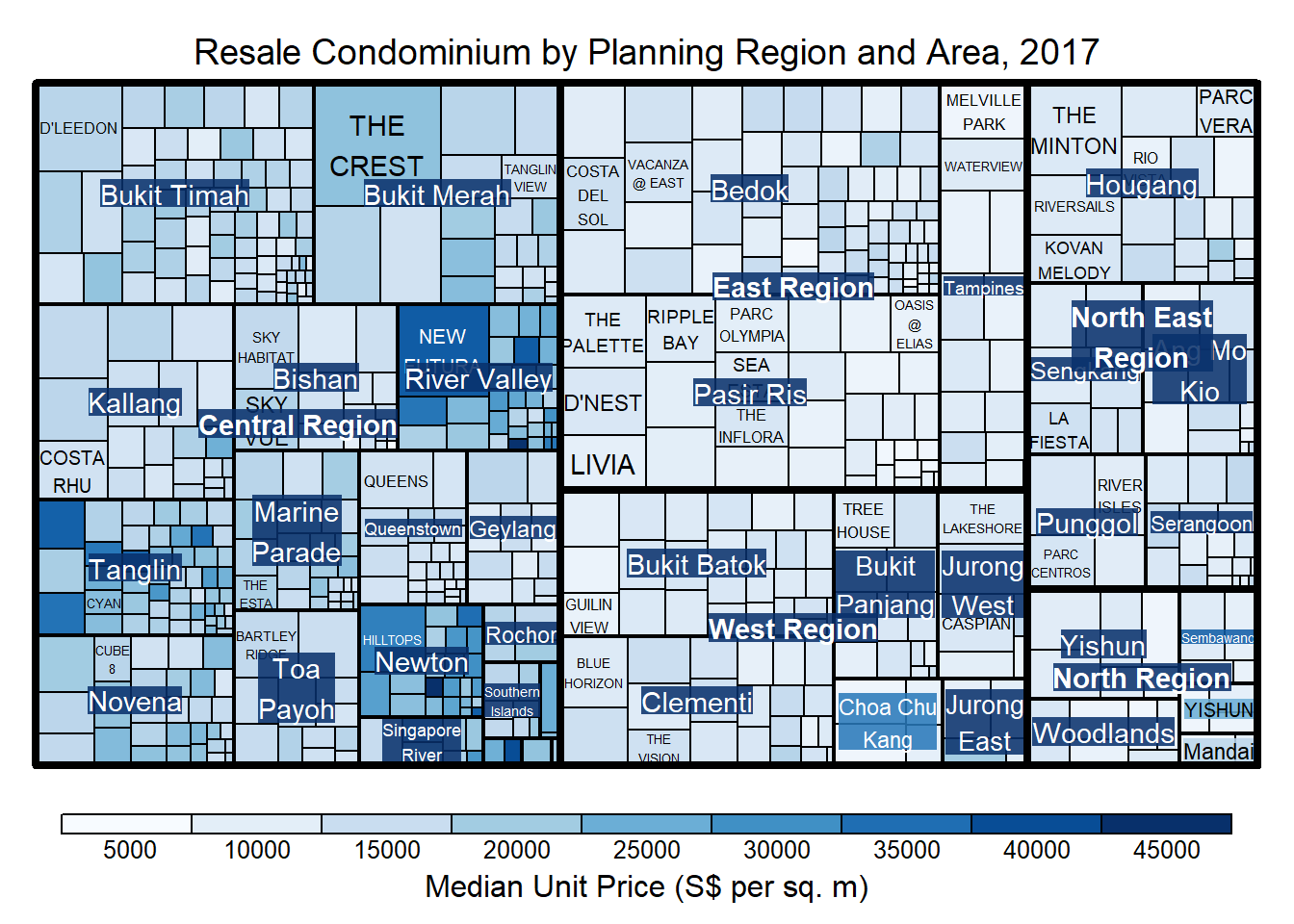
treemap(realis2018_selected,
        index=c("Planning Region", "Planning Area", "Project Name"),
        vSize="Total Unit Sold",
        vColor="Median Unit Price ($ psm)",
        title="Resale Condominium by Planning Region and Area, 2017",
        title.legend = "Median Unit Price (S$ per sq. m)"
        )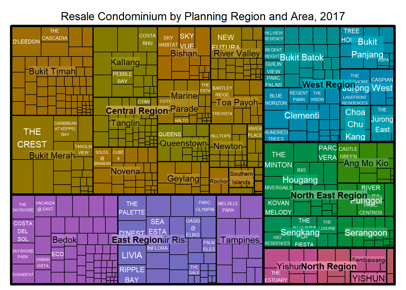
In the treemap above, the size of the cells indicate the number of units sold in each planning area. The bigger the size, the more units sold.
However, the color scheme used does not reflect the median unit price of the condos because it doesn’t tell us which color represent higher unit price or which color represents lower unit price.
3.3 Working with vColor and type arguments
This can be overcomed by adding type argument like the example below:
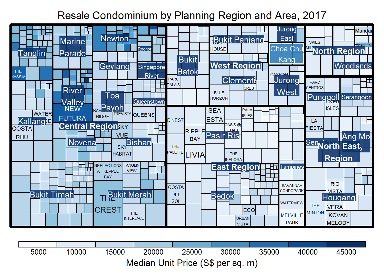
treemap(realis2018_selected,
        index=c("Planning Region", "Planning Area", "Project Name"),
        vSize="Total Unit Sold",
        vColor="Median Unit Price ($ psm)",
        type = "value",
        title="Resale Condominium by Planning Region and Area, 2017",
        title.legend = "Median Unit Price (S$ per sq. m)"
        )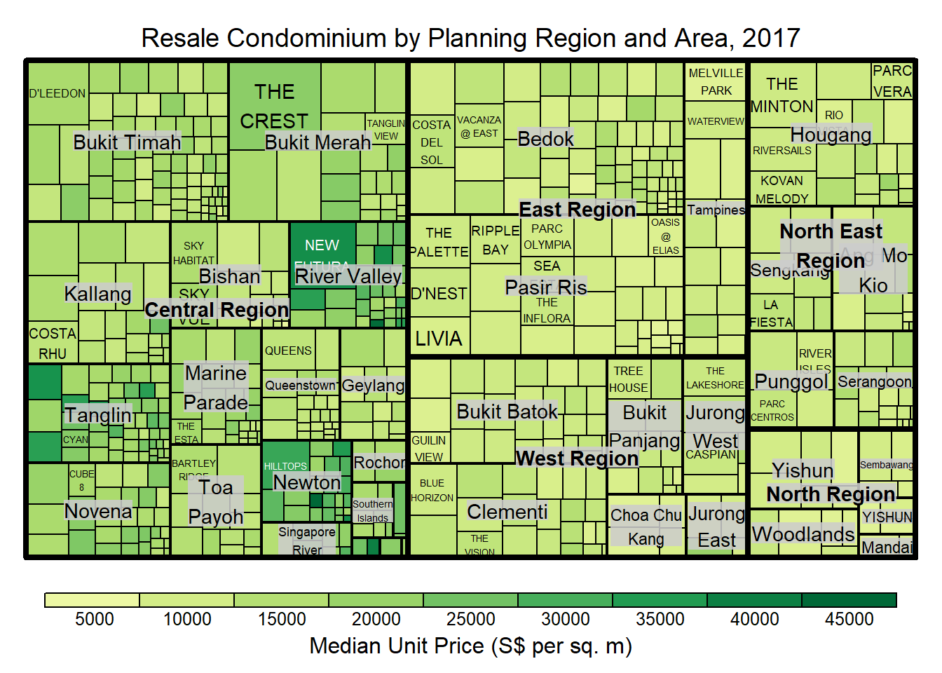
The intensity of the color can now tell us that the darker the color is, the higher the price is.
We can change the color scheme like the example below:
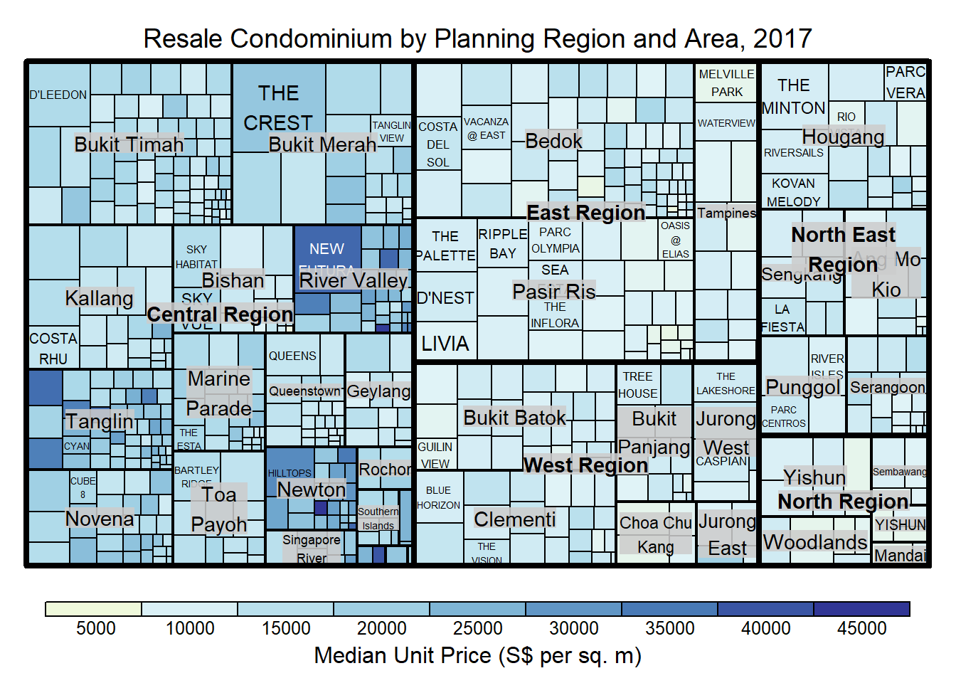
treemap(realis2018_selected,
        index=c("Planning Region", "Planning Area", "Project Name"),
        vSize="Total Unit Sold",
        vColor="Median Unit Price ($ psm)",
        type="value",
        palette="RdYlBu",
        title="Resale Condominium by Planning Region and Area, 2017",
        title.legend = "Median Unit Price (S$ per sq. m)"
        )
The type argument can take another value as “manual” where the value range is mapped linearly to the colour palette. For example,
treemap(realis2018_selected,
        index=c("Planning Region", "Planning Area", "Project Name"),
        vSize="Total Unit Sold",
        vColor="Median Unit Price ($ psm)",
        type="manual",
        palette="RdYlBu",
        title="Resale Condominium by Planning Region and Area, 2017",
        title.legend = "Median Unit Price (S$ per sq. m)"
        )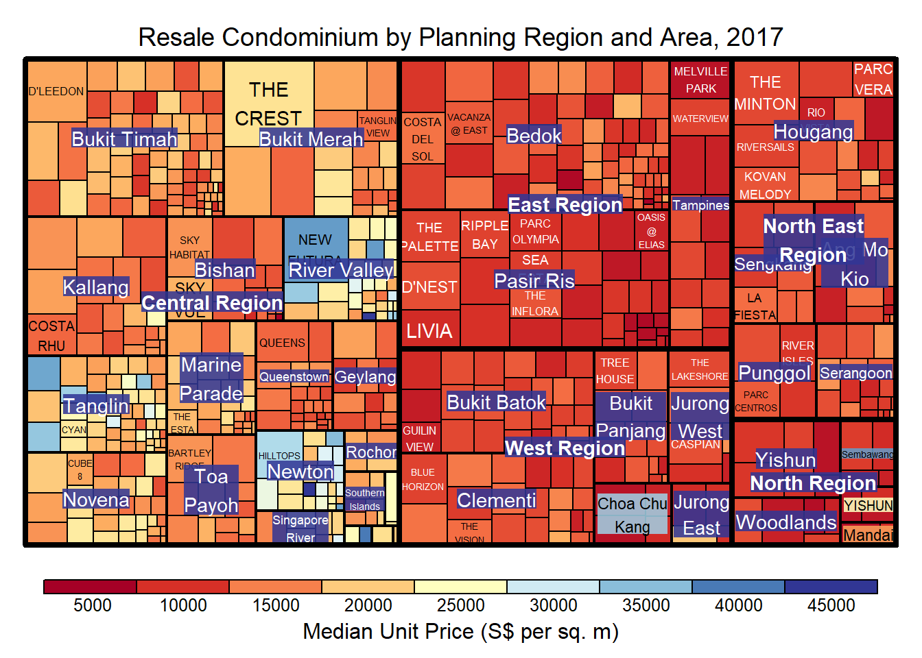
Now we can see that the values of the unit price covers the entire color range.
If we just want to see a single color, then we can specify the palette as follows:
treemap(realis2018_selected,
        index=c("Planning Region", "Planning Area", "Project Name"),
        vSize="Total Unit Sold",
        vColor="Median Unit Price ($ psm)",
        type="manual",
        palette="Blues",
        title="Resale Condominium by Planning Region and Area, 2017",
        title.legend = "Median Unit Price (S$ per sq. m)"
        )
3.4 Working with algorithm argument
The code chunk below plots a squarified treemap by changing the algorithm argument.
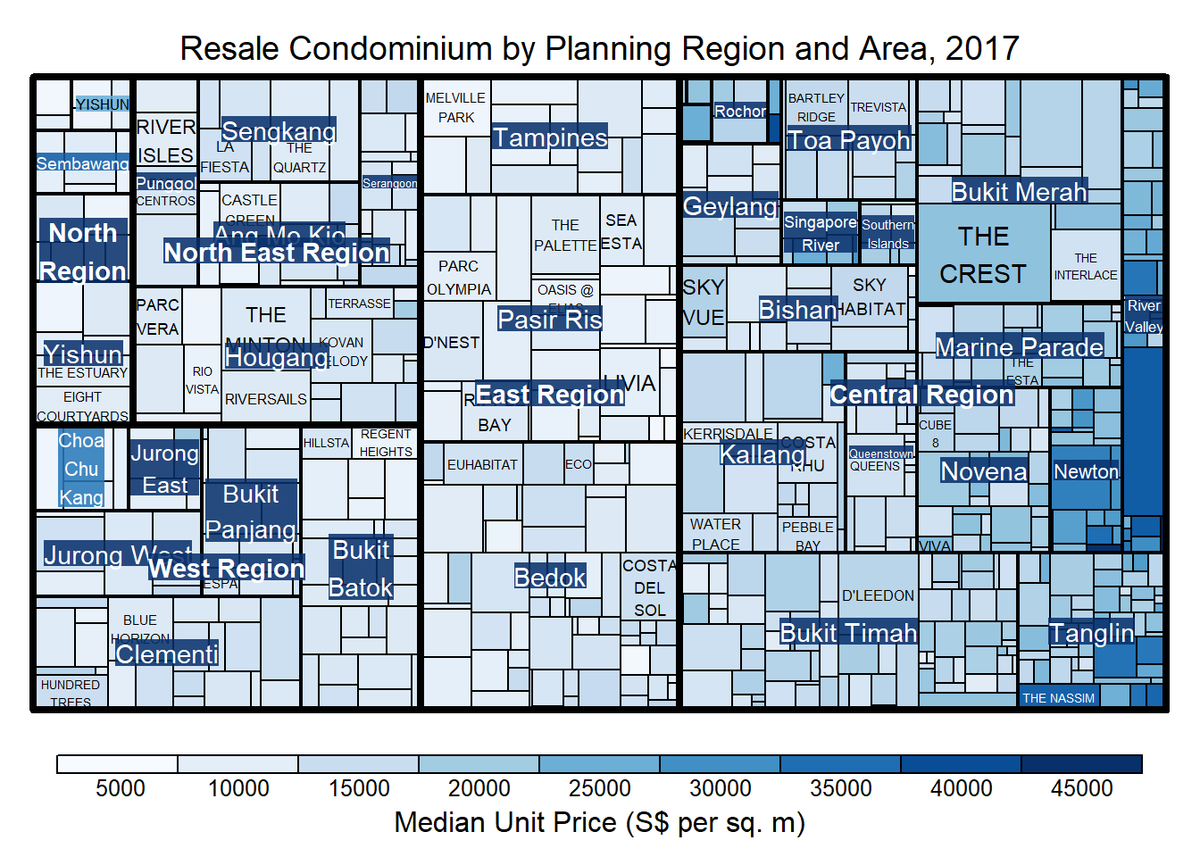
treemap(realis2018_selected,
        index=c("Planning Region", "Planning Area", "Project Name"),
        vSize="Total Unit Sold",
        vColor="Median Unit Price ($ psm)",
        type="manual",
        palette="Blues",
        algorithm = "squarified",
        title="Resale Condominium by Planning Region and Area, 2017",
        title.legend = "Median Unit Price (S$ per sq. m)"
        )
3.5 Using sortID
We can also sort the cells as the way we prefer, from top left to bottom right.
treemap(realis2018_selected,
        index=c("Planning Region", "Planning Area", "Project Name"),
        vSize="Total Unit Sold",
        vColor="Median Unit Price ($ psm)",
        type="manual",
        palette="Blues",
        algorithm = "pivotSize",
        sortID = "Median Transacted Price",
        title="Resale Condominium by Planning Region and Area, 2017",
        title.legend = "Median Unit Price (S$ per sq. m)"
        )
Now, the cells are sorted by median transacted price.
4. Designing Treemap using treemapify Package
In this section, you will learn how to designing treemaps closely resemble treemaps designing in previous section by using treemapify.
4.1 Designing a basic treemap
ggplot(data=realis2018_selected,
       aes(area = `Total Unit Sold`,
           fill = `Median Unit Price ($ psm)`),
       layout = "scol",
       start = "bottomleft") +
  geom_treemap() +
  scale_fill_gradient(low = "light blue", high = "blue")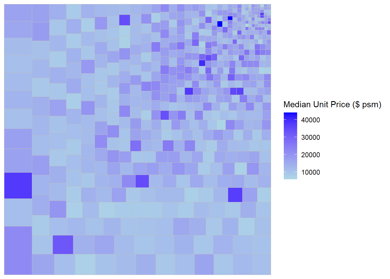
4.2 Defining hierarchy
Group by Planning Region.
ggplot(data=realis2018_selected,
       aes(area = `Total Unit Sold`,
           fill = `Median Unit Price ($ psm)`,
           subgroup = `Planning Region`),
       start = "topleft") +
  geom_treemap()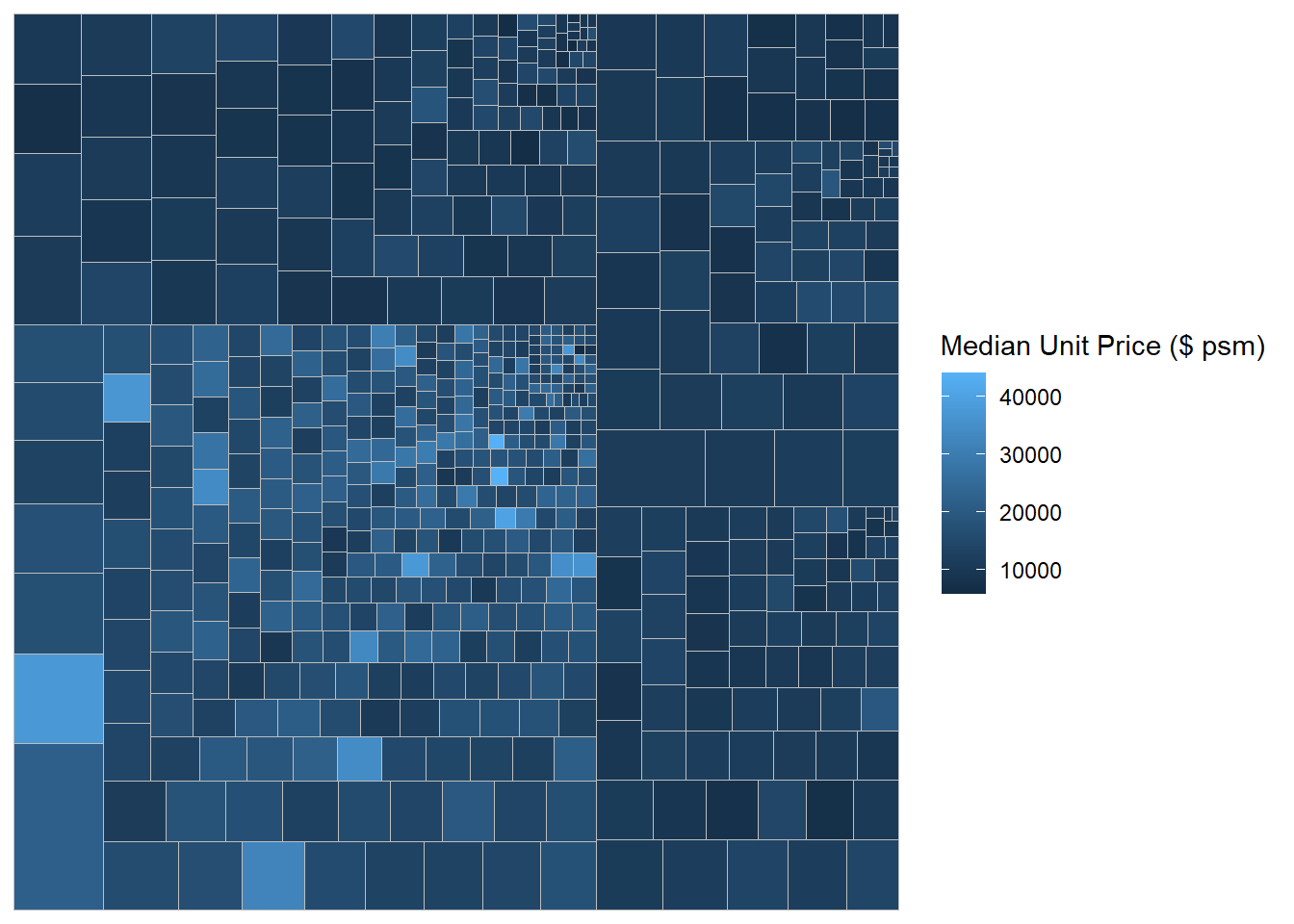
Group by Planning Area.
ggplot(data=realis2018_selected,
       aes(area = `Total Unit Sold`,
           fill = `Median Unit Price ($ psm)`,
           subgroup = `Planning Region`,
           subgroup2 = `Planning Area`)) +
  geom_treemap()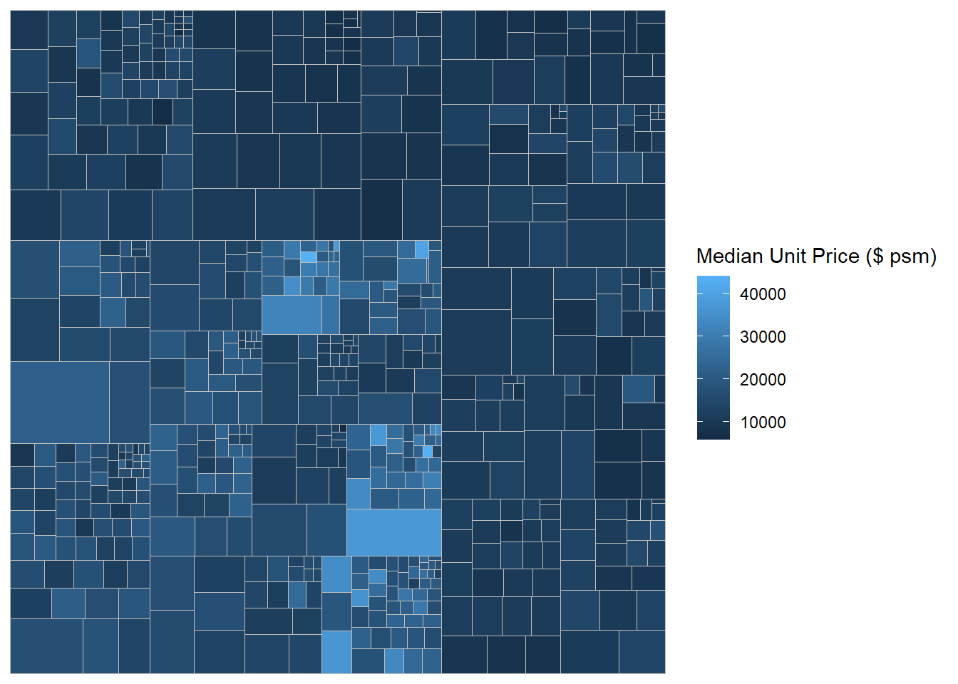
Adding boundary line.
ggplot(data=realis2018_selected,
       aes(area = `Total Unit Sold`,
           fill = `Median Unit Price ($ psm)`,
           subgroup = `Planning Region`,
           subgroup2 = `Planning Area`)) +
  geom_treemap() +
  geom_treemap_subgroup2_border(colour = "gray40",
                                size = 2) +
  geom_treemap_subgroup_border(colour = "gray20")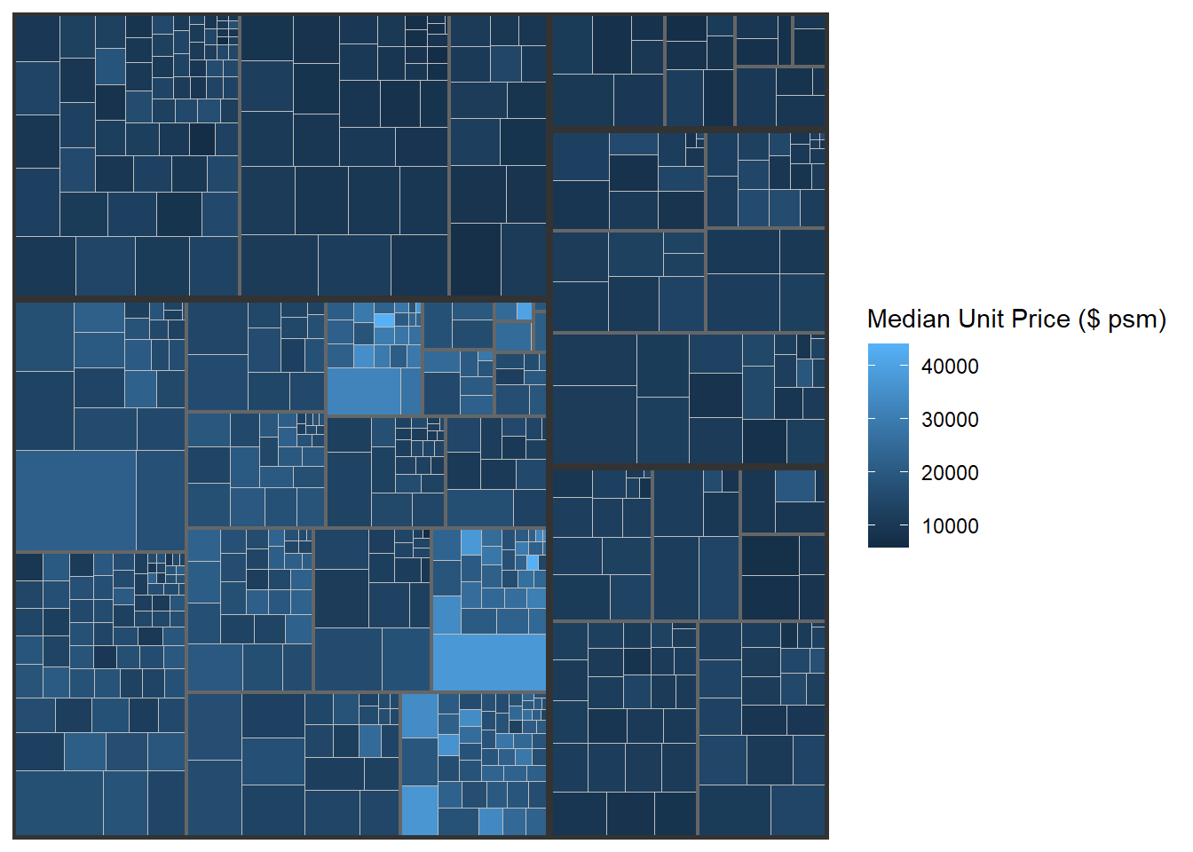
5. Designing Interactive Treemap using d3treeR
In this section, we’ll learn how to make interactive treemaps using d3treeR package.
5.1 Installing d3treeR package
library(devtools)
install_github("timelyportfolio/d3treeR")library(d3treeR)5.2 Designing An Interactive Treemap
We are now ready to create an interactive treemap.
Step 1:
tm <- treemap(realis2018_summarised,
        index=c("Planning Region", "Planning Area"),
        vSize="Total Unit Sold",
        vColor="Median Unit Price ($ psm)",
        type="value",
        title="Private Residential Property Sold, 2017",
        title.legend = "Median Unit Price (S$ per sq. m)"
        )
Step 2:
d3tree(tm,rootname = "Singapore" )When we click on any cells in the treemap above, it’ll zoom into that particular planning area.
This comes to the end of this hands-on exercise. I have learned to make static and interactive treemaps plots in R. Hope you enjoyed it, too!
See you in the next hands-on exercise 🥰