pacman::p_load(tidyverse, seriation, heatmaply, dendextend)Heatmap for Visualising and Analysing Multivariate Data
1. Learning Outcome
In this hands-on exercise, we will learn how to plot static and interactive heatmap for visualising and analysing multivariate data.
2. Getting Started
2.1 Installing and loading the required libraries
Firstly, let’s install and load the required packages:
tidyverse: an opinionated collection of R packages designed for data import, data wrangling and data exploration
seriation: provides the infrastructure for ordering objects with an implementation of several seriation/sequencing/ordination techniques to reorder matrices, dissimilarity matrices, and dendrograms.
heatmaply: An object of class heatmapr includes all the needed information for producing a heatmap.
dendextend: offers a set of functions for extending dendrogram objects in R, letting you visualize and compare trees of hierarchical clusterings.
2.2 Importing the data
We’ll use the data of World Happines 2018 report for this hands-on exercise. The original data is stored in an excel file, and it’s been converted to a csv file for easy importing.
Let’s start by importing the data.
wh <- read_csv("../../Data/WHData-2018.csv")The data contains 156 rows and 12 columns:
- 2 character variables:
- Country
- Region
- 10 numerical variables:
- Happiness score
- Whisker-high
- Whisker-low
- Dystopia
- GDP per capita
- Social support
- Healthy life expectancy
- Freedom to make life choices
- Generosity
- Perceptions of corruption
2.3 Preparing the data
To create a heatmap, one of the pre-requisity is to use category as the row name instead of the default row number.
row.names(wh) <- wh$CountryIn this exercise, we will use country name as the row names.
2.4 Transforming the data frame into a matrix
Another pre-requisity is that the data needs to be in a matrix format instead of dataframe.
wh1 <- dplyr::select(wh, c(3, 7:12))
wh_matrix <- data.matrix(wh1)
3. Static Heatmap
Let’s first learn how to plot static heatmap.
3.1 heatmap() of R Stats
heatmap() function from base stats allows us to do that.
wh_heatmap <- heatmap(wh_matrix,
                      Rowv = NA, Colv = NA)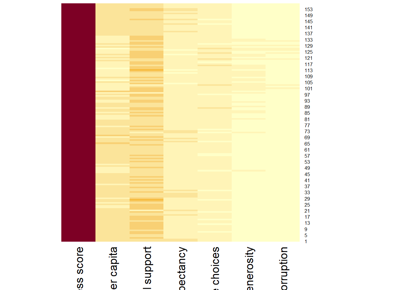
We can plot the rows and columns as dendrograms like the example below.
wh_heatmap <- heatmap(wh_matrix)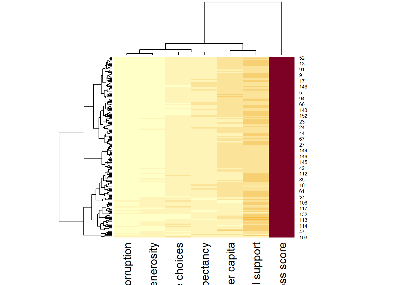
As we noticed, the rows and columns are re-arranged in the second plot because the categories or variables belong to the same cluster have been grouped together.
We can also normalize the values by column to avoid mis-leading information.
wh_heatmap <- heatmap(wh_matrix,
                      scale = "column",
                      cexRow = 0.6,
                      cexCol = 0.8,
                      margins = c(10, 4))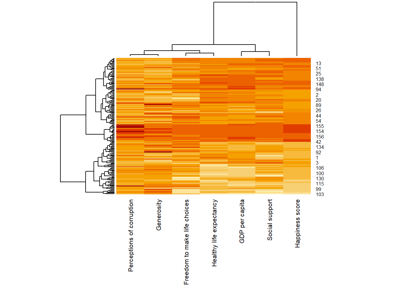
4. Interactive Heatmap
In this section, we’ll create some interactive heatmaps using heatmaply package so we can interpret the information better.
4.1 Working with heatmaply
heatmaply(wh_matrix)When we mouse over the cells in the heatmap, the relevant information is displayed such as row category, column category and the respective value.
We can also select the columns that we are interested.
heatmaply(wh_matrix[, -c(1, 2, 4, 5)])5. Data trasformation
Similar to the static heatmap, we can also normalize the values by columns so the data is comparable.
5.1 Scaling method
We can transform all the columns to standard normal distribution using the code below.
heatmaply(wh_matrix[, -c(1, 2, 4, 5)],
          scale = "column")
5.2 Normalising method
Min-max transformation to bring the values into a range of 0 - 1, regardless of distribution.
heatmaply(normalize(wh_matrix[, -c(1, 2, 4, 5)]))5.3 Percentising method
Rank the values by bringing the values to their empirical percentiles.
heatmaply(percentize(wh_matrix[, -c(1, 2, 4, 5)]))6. Clustering algorithm
heatmaply also supports a variety of hierarchical clustering algorithm.
6.1 Manual approach
We can specify the type of hierachical clustering like the example below.
heatmaply(normalize(wh_matrix[ , -c(1, 2, 4, 5)]),
          dist_method = "euclidean",
          hclust_method = "ward.D")
6.2 Statistical approach
We first determine the best clustering method using the code below.
wh_d <- dist(normalize(wh_matrix[, -c(1, 2, 4, 5)]),
             method = "euclidean")
dend_expend(wh_d)[[3]]
dist_methods hclust_methods optim
1 unknown ward.D 0.6765398
2 unknown ward.D2 0.6700807
3 unknown single 0.7219100
4 unknown complete 0.7259444
5 unknown average 0.8023959
6 unknown mcquitty 0.7031276
7 unknown median 0.7654802
8 unknown centroid 0.8122677We can conclude that “centroid” method should be used as it has the highest optimum value.
We then use the scree plot to determine the number of clusters.
wh_clust <- hclust(wh_d, method = "centroid")
num_k <- find_k(wh_clust)
plot(num_k)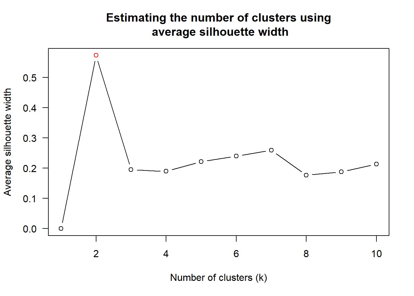
The scree plot tells that k = 2 is the best.
Then we can create the heatmap with the method and number of clusters chosen.
heatmaply(normalize(wh_matrix[, -c(1, 2, 4, 5)]),
          dist_method = "euclidean",
          hclust_method = "centroid",
          k_row = 2)
7. Seriation
heatmaply uses the seriation package to find an optimal ordering of rows and columns. Optimal means to optimize the Hamiltonian path length that is restricted by the dendrogram structure. This, in other words, means to rotate the branches so that the sum of distances between each adjacent leaf (label) will be minimized. This is related to a restricted version of the travelling salesman problem.
Here we meet our first seriation algorithm: Optimal Leaf Ordering (OLO). This algorithm starts with the output of an agglomerative clustering algorithm and produces a unique ordering, one that flips the various branches of the dendrogram around so as to minimize the sum of dissimilarities between adjacent leaves. Here is the result of applying Optimal Leaf Ordering to the same clustering result as the heatmap above.
heatmaply(normalize(wh_matrix[, -c(1, 2, 4, 5)]),
          seriate = "OLO")
The default options is “OLO” (Optimal leaf ordering) which optimizes the above criterion (in O(n^4)). Another option is “GW” (Gruvaeus and Wainer) which aims for the same goal but uses a potentially faster heuristic.
heatmaply(normalize(wh_matrix[, -c(1, 2, 4, 5)]),
          seriate = "GW")
The option “mean” gives the output we would get by default from heatmap functions in other packages such as gplots::heatmap.2.
heatmaply(normalize(wh_matrix[, -c(1, 2, 4, 5)]),
          seriate = "mean")
The option “none” gives us the dendrograms without any rotation that is based on the data matrix.
heatmaply(normalize(wh_matrix[, -c(1, 2, 4, 5)]),
          seriate = "none")
8. Working with colour palettes
We have been using the default color scale in the works above. However, we can customize the colors like the example below.
heatmaply(normalize(wh_matrix[, -c(1, 2, 4, 5)]),
          seriate = "none",
          colors = Blues)
9. The finishing touch
We can further customize the heatmap like the example below.
heatmaply(normalize(wh_matrix[, -c(1, 2, 4, 5)]),
          Colv = NA,
          seriate = "none",
          colors = Blues,
          k_row = 5,
          margins = c(NA,200,60,NA),
          fontsize_row = 4,
          fontsize_col = 5,
          main="World Happiness Score and Variables by Country, 2018 \nDataTransformation using Normalise Method",
          xlab = "World Happiness Indicators",
          ylab = "World Countries"
          )
This comes to the end of this hands-on exercise. I have learned to different ways to create heatmap in R. Hope you enjoyed it, too!
See you in the next hands-on exercise 🥰