pacman::p_load(tidyverse, corrplot, ggstatsplot, plotly)Visual Correlation Analysis
1. Learning Outcome
In this hands-on exercise, we will learn how to plot data visualisation for visualising correlation matrix with R.
2. Getting Started
2.1 Installing and loading the required libraries
Firstly, let’s install and load the required packages:
tidyverse: an opinionated collection of R packages designed for data import, data wrangling and data exploration
corrplot: provides a visual exploratory tool on correlation matrix that supports automatic variable reordering to help detect hidden patterns among variables.
ggstatsplot: a ggplot2 extension for creating graphics with details from statistical tests included in the information-rich plots themselves.
2.2 Importing the data
We’ll use wine quality data from UCI Machine Learning Repository for this hands-on exercise. The orginal data is stored in two datasets, one is for red vinho wine samples and the other one is for white vinho wine samples. We’ll combine these two datasets, and the data is saved in a csv file.
Let’s start by importing the data.
wine <- read_csv("../../Data/wine_quality.csv")The data contains 6,497 rows and 13 columns:
- 1 character variables:
- type
- 12 numerical variables:
- fixed acidity
- volatile acidity
- citric acid
- residual sugar
- chlorides
- free sulfur dioxide
- total sulfur dioxide
- density
- pH
- sulphates
- alcohol
- quality
3. Building Correlation Matrix: pairs() method
In this section, we will learn how to create a scatterplot matrix by using the pairs function of R Graphics.
3.1 Building a basic correlation matrix
Let’s first create a basic correlation matrix using the first 11 columns which describe the characteristics of the wine.
pairs(wine[ , 1:11])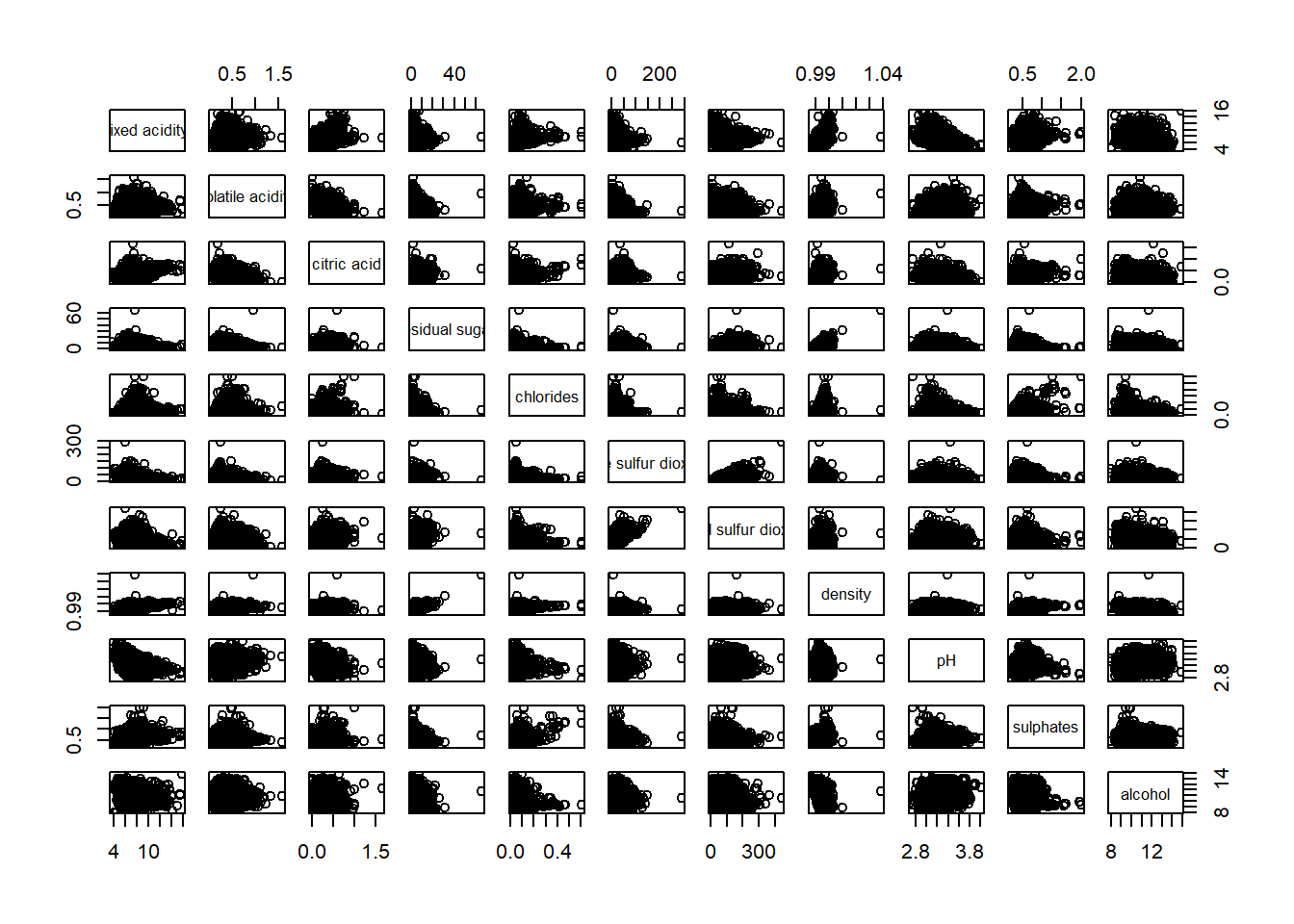
It is a 11 x 11 correlation matrix, and it’s symmetrical along the diagonal. This correlation matrix is helpful when we check for multi-collinearity among the variables.
Next, we can create a correlation matrix to see which variable has strong correlation with wine quality.
pairs(wine[ , 2:12])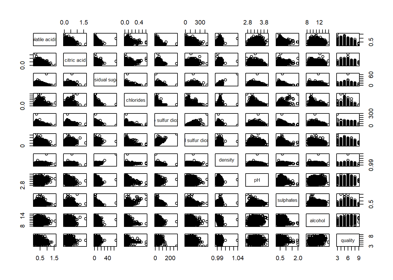
3.2 Drawing the lower corner
We noticed that the upper half of the correlation matrix provides the same information as the lower half of the matrix. Therefore, we can set an argument to show only the lower half of the matrix.
pairs(wine[ , 2:12], upper.panel = NULL)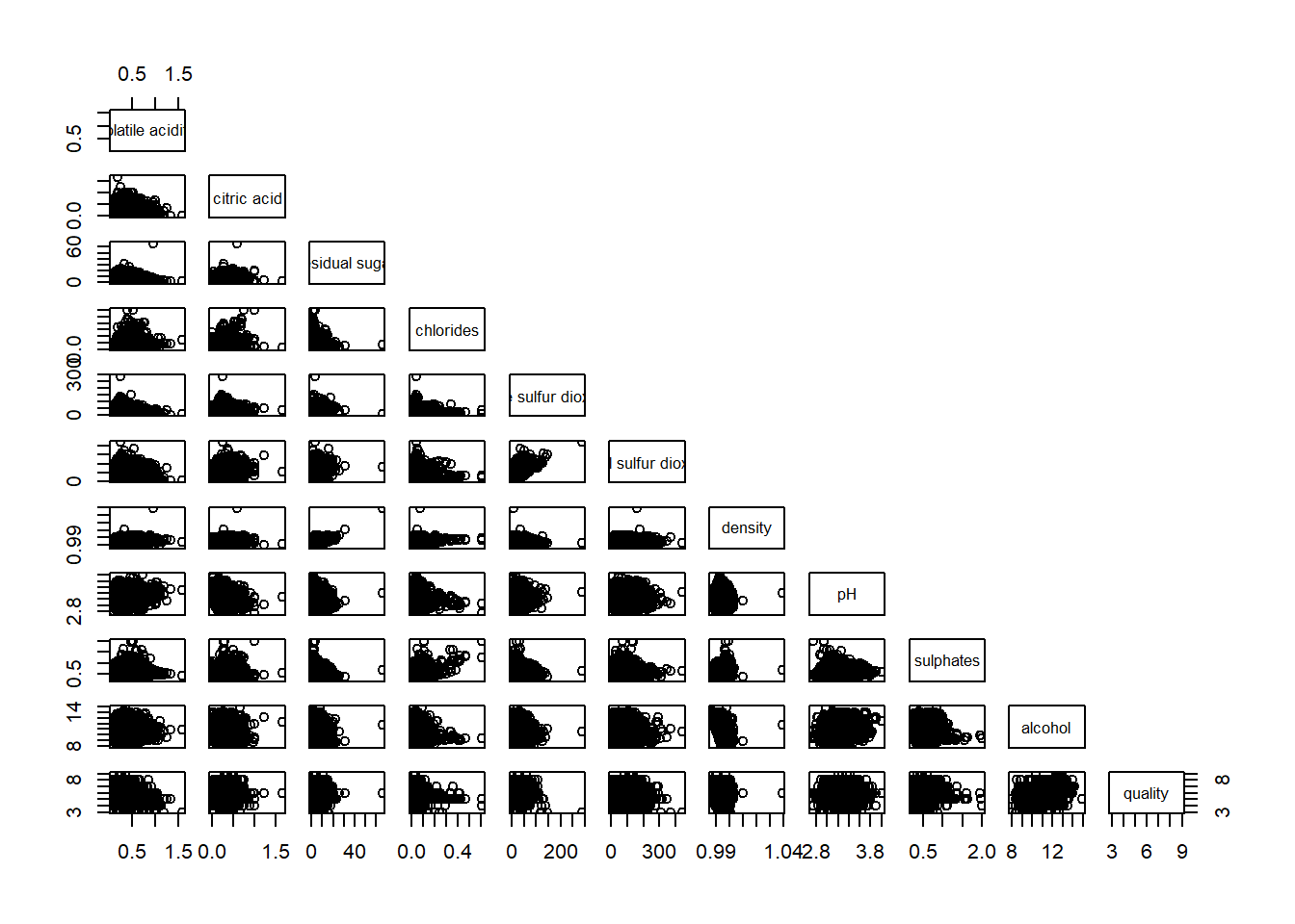
of course, we can also choose to show the upper half of the matrix.
pairs(wine[ , 2:12], lower.panel = NULL)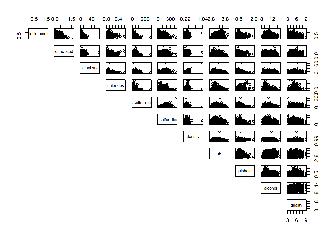
3.3 Including with correlation coefficients
We can also show the correlation coefficients in the matrix to allows us to make better judgement.
panel.cor <- function(x, y, digits = 2, prefix = "", cex.cor, ...) {
  usr <- par("usr")
  on.exit(par(usr))
  par(usr = c(0, 1, 0, 1))
  r <- abs(cor(x, y, use = "complete.obs"))
  txt <- format(c(r, 0.123456789), digits = digits)[1]
  txt <- paste(prefix, txt, sep = "")
  if(missing(cex.cor))
    cex.cor <- 0.8 / strwidth(txt)
  text(0.5, 0.5, txt, cex = cex.cor * (1 + r) / 2)
}

pairs(wine[ , 2:12],
      upper.panel = panel.cor)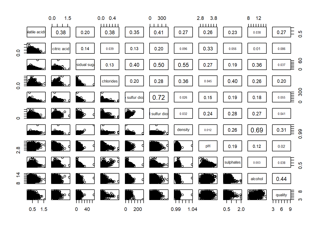
4. Visualising Correlation Matrix: ggcormat()
While the scatter plots is straight forward to visualize the correlation between two variables when sample size is small, it becomes challenging as the sample size grows.
In this section, we’ll use ggcormat() function from ggstatsplot to overcome this limitation.
4.1 The basic plot
One of the ways is to use color scale to represent the strength of correlation.
ggstatsplot::ggcorrmat(
  data = wine,
  cor.vars = 1:11
)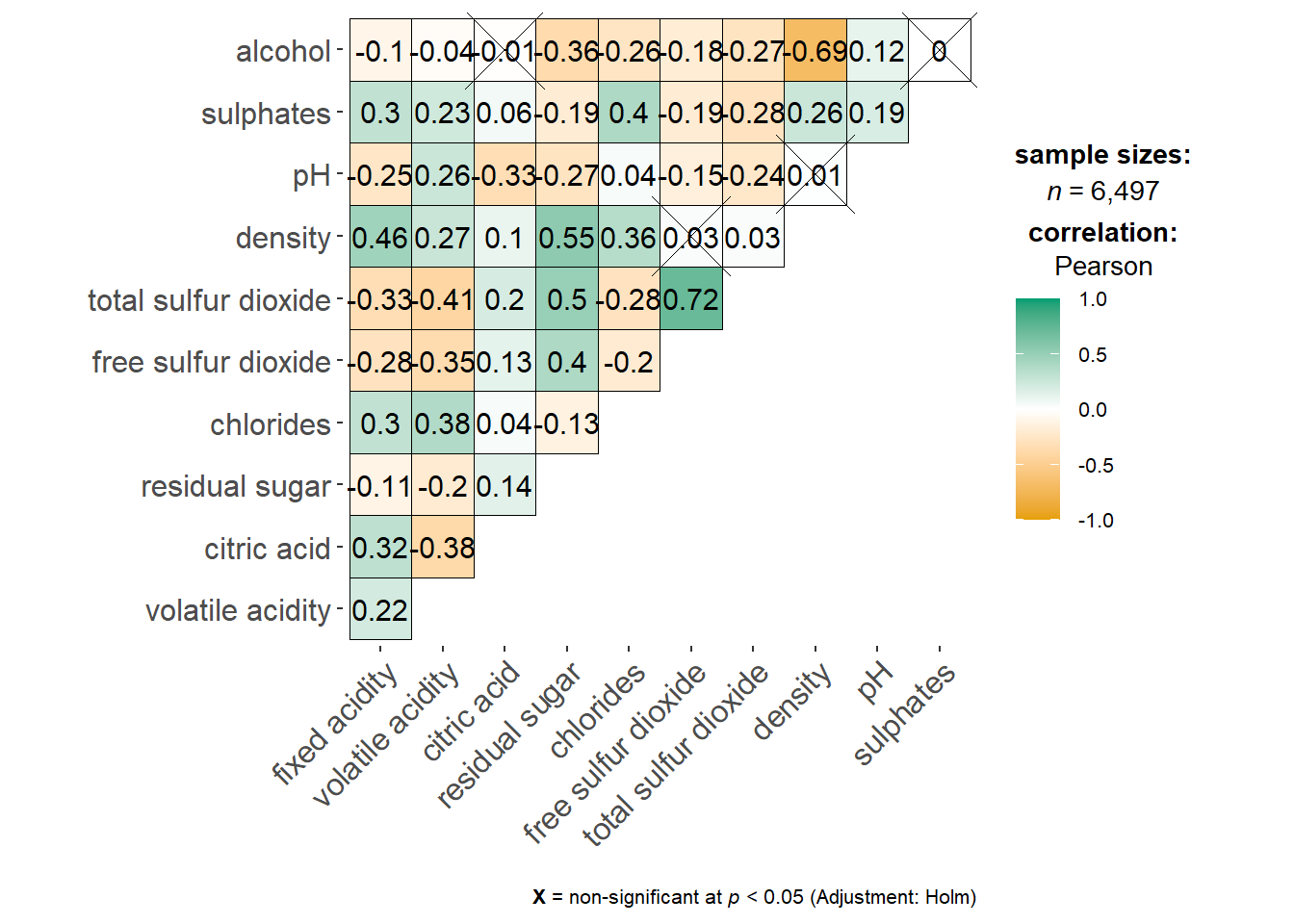
The plot tells us which pairs have insignificant correlation by marking a cross in the respective boxes.
We can add a title and subtitle in the plot to make it more informative.
ggstatsplot::ggcorrmat(
  data = wine,
  cor.vars = 1:11,
  ggcorrplot.args = list(outline.color = "black",
                         hc.order = TRUE,
                         tl.cex = 10),
  title    = "Correlogram for wine dataset",
  subtitle = "Four pairs are no significant at p < 0.05"
)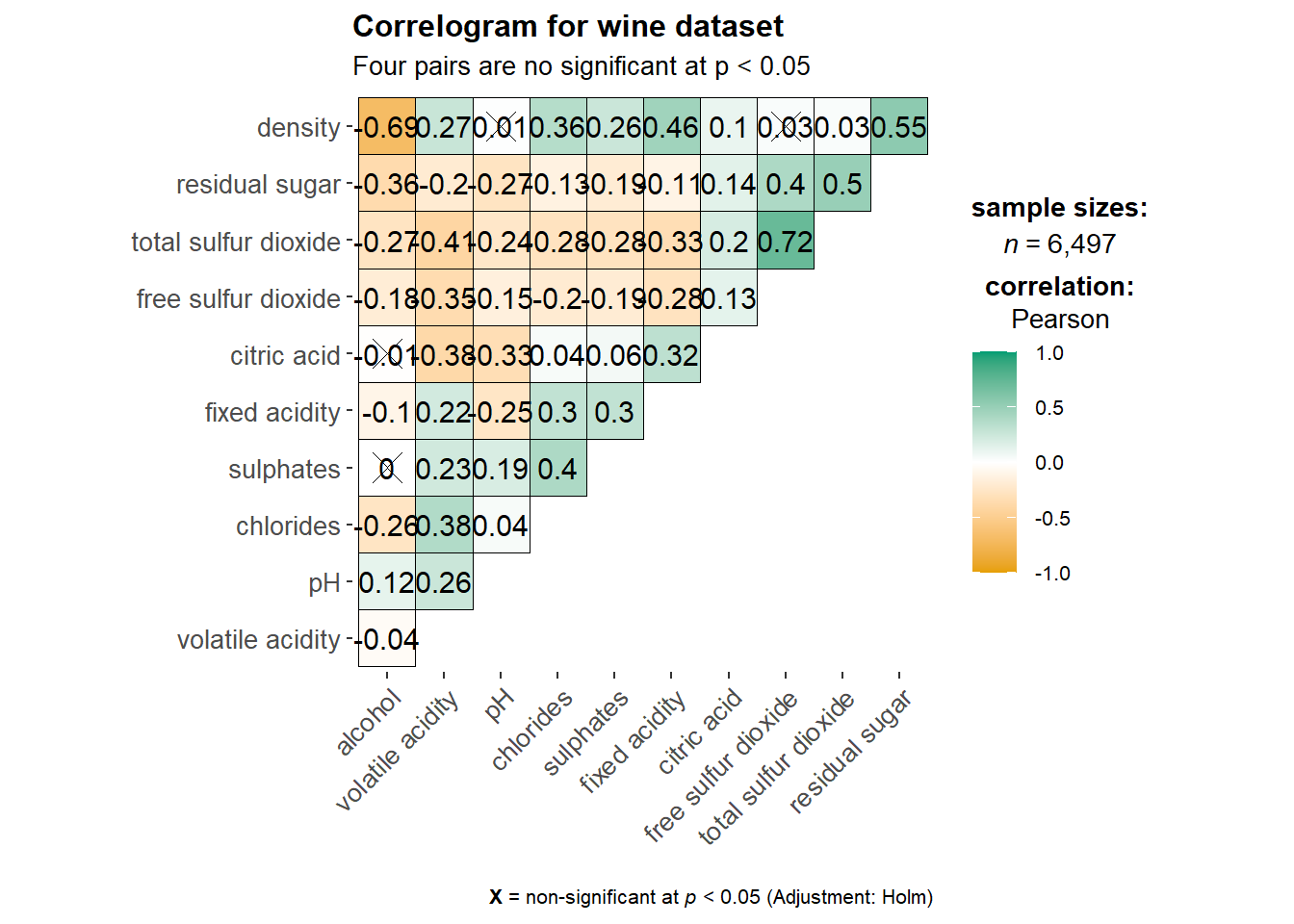
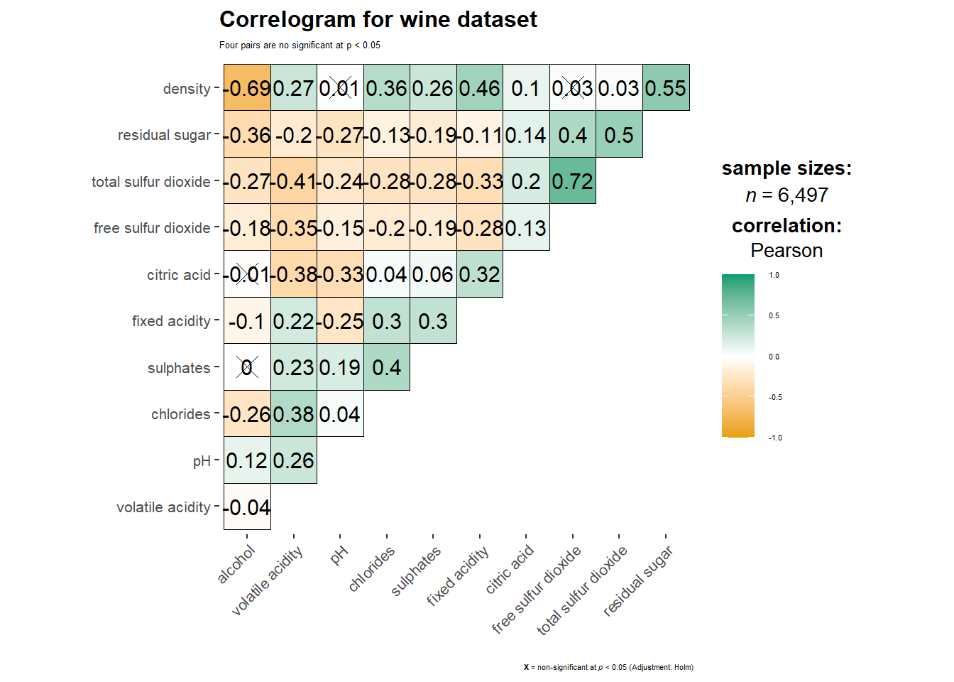
In addition, we can also customize the font size of the title and x / y axis labels.
ggstatsplot::ggcorrmat(
  data = wine,
  cor.vars = 1:11,
  ggcorrplot.args = list(outline.color = "black",
                         hc.order = TRUE,
                         tl.cex = 10),
  title    = "Correlogram for wine dataset",
  subtitle = "Four pairs are no significant at p < 0.05",
  ggplot.component = list(
    theme(text = element_text(size = 5),
      axis.text.x = element_text(size = 8),
      axis.text.y = element_text(size = 8)))
)
4.2 Building multiple plots
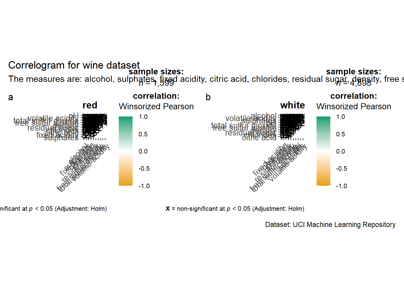
ggstatsplot package also allows us to plot multiple correlation matrix. For example, we can plot one matrix for red wine and one for white wine.
grouped_ggcorrmat(
  data = wine,
  cor.vars = 1:11,
  grouping.var = type,
  type = "robust",
  p.adjust.method = "holm",
  plotgrid.args = list(ncol = 2),
  ggcorrplot.args = list(outline.color = "black",
                         hc.order = TRUE,
                         tl.cex = 10),
  annotation.args = list(
    tag_levels = "a",
    title = "Correlogram for wine dataset",
    subtitle = "The measures are: alcohol, sulphates, fixed acidity, citric acid, chlorides, residual sugar, density, free sulfur dioxide and volatile acidity",
    caption = "Dataset: UCI Machine Learning Repository"
  )
)
5. Visualising Correlation Matrix using corrplot Package
In the next section, we’ll learn how to visualize correlation matrix using corrplot plackage.
5.1 Getting started with corrplot
Unlike the previous methods, we need to compute the correlation matrix of wine data frame before creating the plot.
wine.cor <- cor(wine[ , 1:11])Now, we can make the plot using the correlation matrix just created.
corrplot(wine.cor)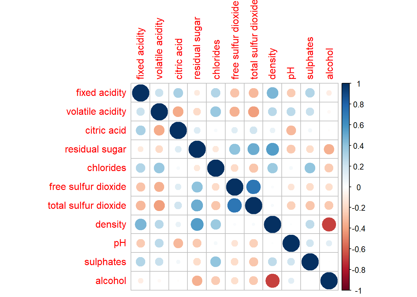
Both the intensity of the colors and the size of the circles indicate the strength of the pairwise correlation.
5.2 Working with visual geometrics
The package provides a few options for us to customize our plots by changing the method argument.
For example, we can set method = ellipse to show the direction of the correlation.
corrplot(wine.cor,
method = "ellipse") 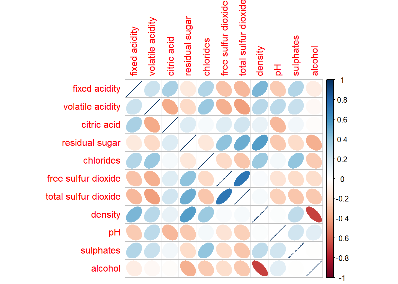
5.3 Working with layout
We can choose to show either upper or lower half of the matrix to remove redundancy.
corrplot(wine.cor,
         method = "ellipse",
         type = "lower")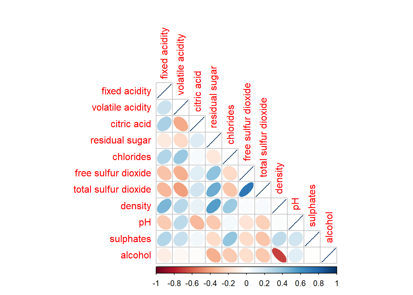
We can remove the diagonal by setting diag = FALSE.
corrplot(wine.cor,
         method = "ellipse",
         type = "lower",
         diag = FALSE,
         tl.col = "black")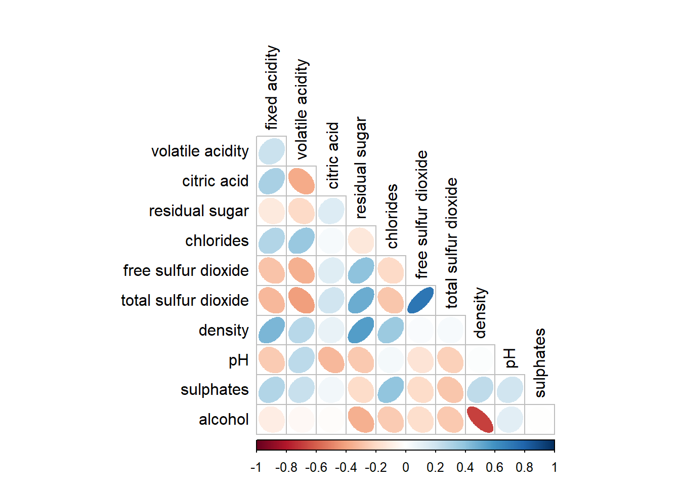
5.4 Working with mixed layout
Similar to the previous method, we can show correlation coefficient in the correlation matrix plot.
corrplot.mixed(wine.cor,
               lower = "ellipse",
               upper = "number",
               tl.pos = "lt",
               diag = "l",
               tl.col = "black")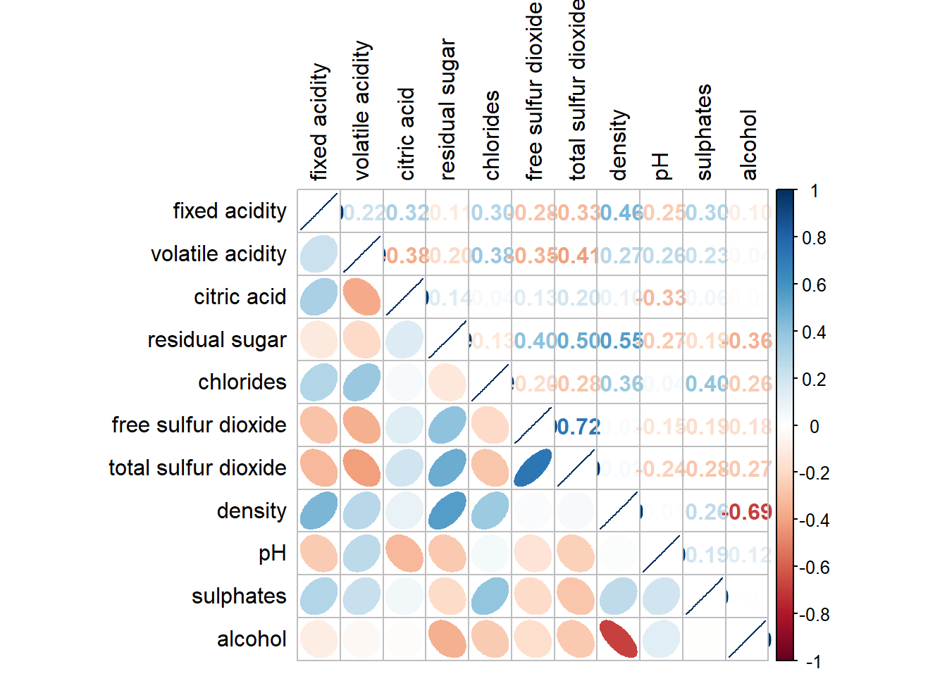
5.5 Combining corrgram with the significant test
Let’s now add significance test results in the correlation matrix plot.
wine.sig = cor.mtest(wine.cor, conf.level = 0.95)corrplot(wine.cor,
method = "number",
type = "lower",
diag = FALSE,
tl.col = "black",
tl.srt = 45,
p.mat = wine.sig$p,
sig.level = 0.05)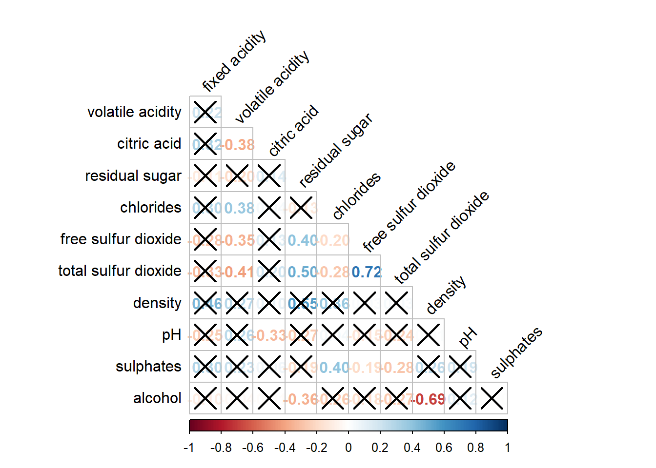
5.6 Reorder a corrgram
We can also re-order the variables.
corrplot.mixed(wine.cor,
               lower = "ellipse",
               upper = "number",
               tl.pos = "lt",
               diag = "l",
               order = "AOE",
               tl.col = "black")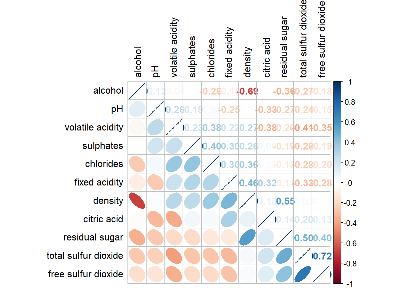
5.7 Reordering a correlation matrix using hclust
If hclust is used, then the variables within the same cluster will be boxed in the plot.
corrplot(wine.cor,
         method = "ellipse",
         tl.pos = "lt",
         tl.col = "black",
         order = "hclust",
         hclust.method = "ward.D",
         addrect = 3)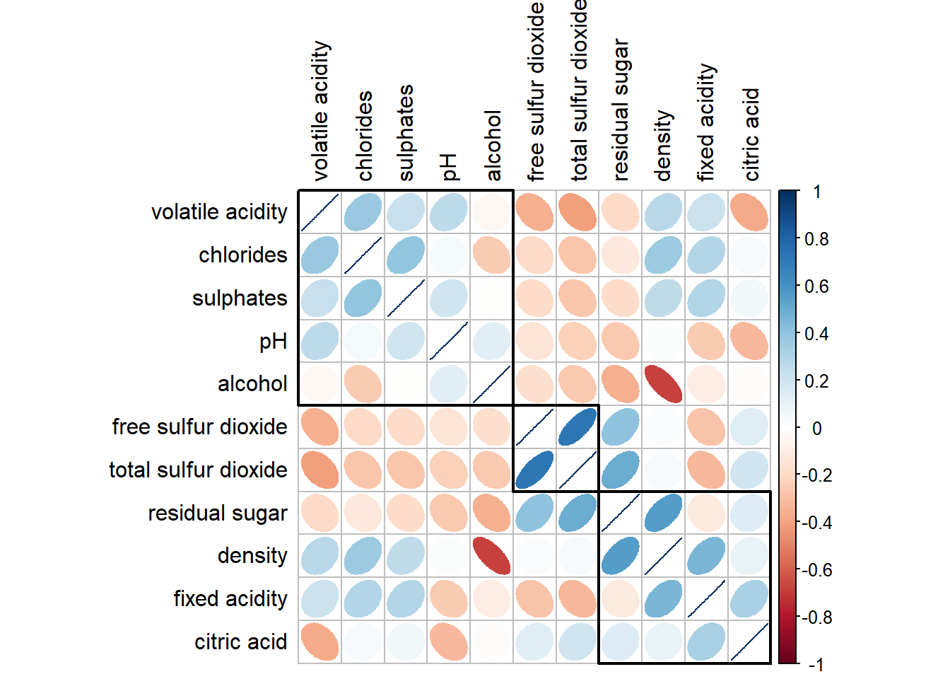
This comes to the end of this hands-on exercise. I have learned to different ways to visualize correlation matrix in R. Hope you enjoyed it, too!
See you in the next hands-on exercise 🥰