pacman::p_load(tidyverse, sf, tmap)Choropleth Mapping with R
1. Learning Outcome
In this hands-on exercise, we will learn how to plot functional and truthful choropleth maps by using an R package called tmap package.
2. Getting Started
2.1 Installing and loading the required libraries
Firstly, let’s install and load the required packages:
tidyverse: an opinionated collection of R packages designed for data import, data wrangling and data exploration
sf: a standardized way to encode spatial vector data.
tmap: makes it easier to plot thematic maps.
2.2 Importing the data
In this exercise, two data sets will be used.
Master Plan 2014 Subzone Boundary (Web) (i.e. MP14_SUBZONE_WEB_PL) in ESRI shapefile format. It can be downloaded at data.gov.sg This is a geospatial data. It consists of the geographical boundary of Singapore at the planning subzone level. The data is based on URA Master Plan 2014.
Singapore Residents by Planning Area / Subzone, Age Group, Sex and Type of Dwelling, June 2011-2020 in csv format (i.e. respopagesextod2011to2020.csv). This is an aspatial data fie. It can be downloaded at Department of Statistics, Singapore Although it does not contain any coordinates values, but it’s PA and SZ fields can be used as unique identifiers to geocode to MP14_SUBZONE_WEB_PL shapefile.
Let’s start by importing the data.
2.2.1 Importing Geospatial Data into R
Let’s first import MP14_SUBZONE_WEB_PL shapefile into R as a simple feature data frame called mpsz using st_read() function of sf package.
mpsz <- st_read(dsn = "../../Data/hands-on_ex07/geospatial",
                layer = "MP14_SUBZONE_WEB_PL")
Reading layer `MP14_SUBZONE_WEB_PL' from data source
`D:\MITB_SunYP\ISSS608\Data\hands-on_ex07\geospatial' using driver `ESRI Shapefile'
Simple feature collection with 323 features and 15 fields
Geometry type: MULTIPOLYGON
Dimension: XY
Bounding box: xmin: 2667.538 ymin: 15748.72 xmax: 56396.44 ymax: 50256.33
Projected CRS: SVY21mpszSimple feature collection with 323 features and 15 fields
Geometry type: MULTIPOLYGON
Dimension: XY
Bounding box: xmin: 2667.538 ymin: 15748.72 xmax: 56396.44 ymax: 50256.33
Projected CRS: SVY21
First 10 features:
OBJECTID SUBZONE_NO SUBZONE_N SUBZONE_C CA_IND PLN_AREA_N
1 1 1 MARINA SOUTH MSSZ01 Y MARINA SOUTH
2 2 1 PEARL'S HILL OTSZ01 Y OUTRAM
3 3 3 BOAT QUAY SRSZ03 Y SINGAPORE RIVER
4 4 8 HENDERSON HILL BMSZ08 N BUKIT MERAH
5 5 3 REDHILL BMSZ03 N BUKIT MERAH
6 6 7 ALEXANDRA HILL BMSZ07 N BUKIT MERAH
7 7 9 BUKIT HO SWEE BMSZ09 N BUKIT MERAH
8 8 2 CLARKE QUAY SRSZ02 Y SINGAPORE RIVER
9 9 13 PASIR PANJANG 1 QTSZ13 N QUEENSTOWN
10 10 7 QUEENSWAY QTSZ07 N QUEENSTOWN
PLN_AREA_C REGION_N REGION_C INC_CRC FMEL_UPD_D X_ADDR
1 MS CENTRAL REGION CR 5ED7EB253F99252E 2014-12-05 31595.84
2 OT CENTRAL REGION CR 8C7149B9EB32EEFC 2014-12-05 28679.06
3 SR CENTRAL REGION CR C35FEFF02B13E0E5 2014-12-05 29654.96
4 BM CENTRAL REGION CR 3775D82C5DDBEFBD 2014-12-05 26782.83
5 BM CENTRAL REGION CR 85D9ABEF0A40678F 2014-12-05 26201.96
6 BM CENTRAL REGION CR 9D286521EF5E3B59 2014-12-05 25358.82
7 BM CENTRAL REGION CR 7839A8577144EFE2 2014-12-05 27680.06
8 SR CENTRAL REGION CR 48661DC0FBA09F7A 2014-12-05 29253.21
9 QT CENTRAL REGION CR 1F721290C421BFAB 2014-12-05 22077.34
10 QT CENTRAL REGION CR 3580D2AFFBEE914C 2014-12-05 24168.31
Y_ADDR SHAPE_Leng SHAPE_Area geometry
1 29220.19 5267.381 1630379.3 MULTIPOLYGON (((31495.56 30...
2 29782.05 3506.107 559816.2 MULTIPOLYGON (((29092.28 30...
3 29974.66 1740.926 160807.5 MULTIPOLYGON (((29932.33 29...
4 29933.77 3313.625 595428.9 MULTIPOLYGON (((27131.28 30...
5 30005.70 2825.594 387429.4 MULTIPOLYGON (((26451.03 30...
6 29991.38 4428.913 1030378.8 MULTIPOLYGON (((25899.7 297...
7 30230.86 3275.312 551732.0 MULTIPOLYGON (((27746.95 30...
8 30222.86 2208.619 290184.7 MULTIPOLYGON (((29351.26 29...
9 29893.78 6571.323 1084792.3 MULTIPOLYGON (((20996.49 30...
10 30104.18 3454.239 631644.3 MULTIPOLYGON (((24472.11 29...2.2.1 Importing Attribute Data into R
We then import respopagsex2011to2020.csv into R using read_csv() function of readr package.
popdata <- read_csv("../../Data/hands-on_ex07/aspatial/respopagesextod2011to2020.csv")Rows: 984656 Columns: 7
── Column specification ────────────────────────────────────────────────────────
Delimiter: ","
chr (5): PA, SZ, AG, Sex, TOD
dbl (2): Pop, Time
ℹ Use `spec()` to retrieve the full column specification for this data.
ℹ Specify the column types or set `show_col_types = FALSE` to quiet this message.2.3 Data Preparation
In this exercise, we will use the data in 2020 to plot the choropleth graphs, and we’ll use the following columns:
- PA: planning area
- SZ: subzone
- YOUNG: age group 0 to 4 until age group 20 to 24
- ECONOMY ACTIVE: age group 25-29 until age group 60-64
- AGED: age group 65 and above
- TOTAL: all age group
- DEPENDENCY: the ratio between young and aged against economy active group
2.3.1 Data wrangling
Let’s first filter the data by year = 2020 and create the columns listed above.
popdata2020 <- popdata %>%
  filter(Time == 2020) %>%
  group_by(PA, SZ, AG) %>%
  summarise(`POP` = sum(`Pop`)) %>%
  ungroup() %>%
  pivot_wider(names_from = AG,
              values_from = POP) %>%
  mutate(YOUNG = rowSums(.[3:6]) +
           rowSums(.[12])) %>%
  mutate(`ECONOMY ACTIVE` = rowSums(.[7:11]) +
           rowSums(.[13:15])) %>%
  mutate(`AGED` = rowSums(.[16:21])) %>%
  mutate(`TOTAL` = rowSums(.[3:21])) %>%
  mutate(`DEPENDENCY` = (`YOUNG` + `AGED`) / `ECONOMY ACTIVE`) %>%
  select(`PA`,
         `SZ`,
         `YOUNG`,
         `ECONOMY ACTIVE`,
         `AGED`,
         `TOTAL`,
         `DEPENDENCY`)
`summarise()` has grouped output by 'PA', 'SZ'. You can override using the
`.groups` argument.2.3.2 Joining the attribute data and geospatial data
Next, we join the attribute data with the geospatial data.
popdata2020 <- popdata2020 %>%
  mutate_at(.vars = vars(PA, SZ),
            .funs = funs(toupper)) %>%
  filter(`ECONOMY ACTIVE` > 0)
Warning: `funs()` was deprecated in dplyr 0.8.0.
ℹ Please use a list of either functions or lambdas:
# Simple named list: list(mean = mean, median = median)
# Auto named with `tibble::lst()`: tibble::lst(mean, median)
# Using lambdas list(~ mean(., trim = .2), ~ median(., na.rm = TRUE))mpsz_pop2020 <- left_join(mpsz, popdata2020,
by = c("SUBZONE_N" = "SZ"))2.3.3 Saving the rds data
We have now prepared the data, and we can save it for future use.
write_rds(mpsz_pop2020, "../../Data/hands-on_ex07/rds/mpszpop2020.rds")3. Choropleth Mapping Geospatial Data Using tmap
Two approaches can be used to prepare thematic map using tmap, they are:
- Plotting a thematic map quickly by using qtm().
- Plotting highly customisable thematic map by using tmap elements.
We’ll explore both methods in the next sections.
3.1 Plotting a choropleth map quickly by using qtm()
Let’s draw a cartographic standard choropleth map as shown below.
tmap_mode("plot")tmap mode set to plottingqtm(mpsz_pop2020,
fill = "DEPENDENCY")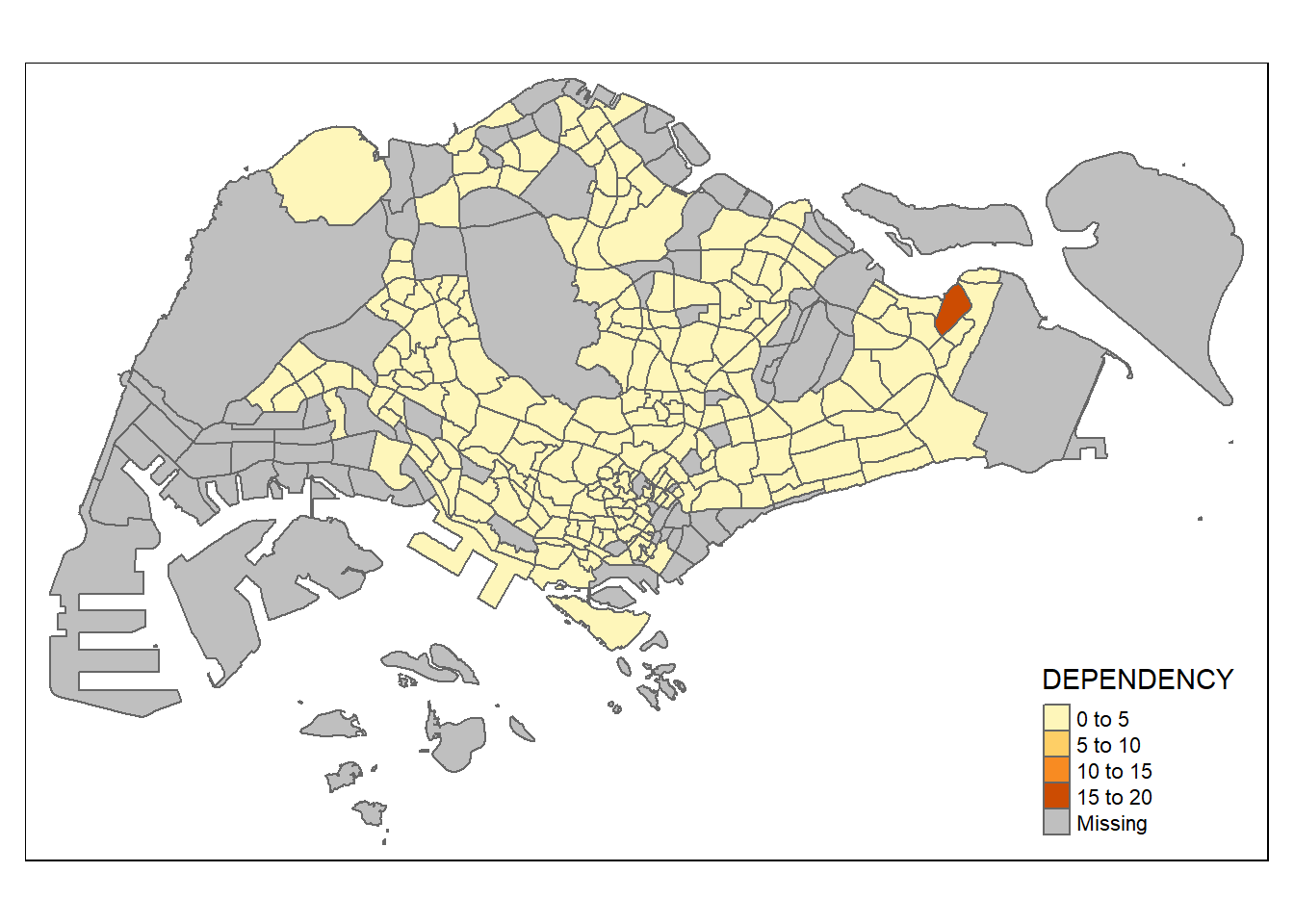
In the map above, we show the subzone boundaries and the color indicates the ratio of young-old dependency. There is one subzone in the east having significantly higher dependency ratio.
3.2 Creating a choropleth map by using tmap’s elements
Next, we’ll customize the choropleth map using tmap elements.
tm_shape(mpsz_pop2020) +
  tm_fill("DEPENDENCY",
          style = "quantile",
          palette = "Blues",
          title = "Dependency ratio") +
  tm_layout(main.title = "Distribution of Dependency Ratio by planning subzone",
            main.title.position = "center",
            main.title.size = 1.2,
            legend.height = 0.45,
            legend.width = 0.35,
            frame = TRUE) +
  tm_borders(alpha = 0.5) +
  tm_compass(type = "8star", size = 2) +
  tm_scale_bar() +
  tm_grid(alpha = 0.2) +
  tm_credits("Source: Planning Sub-zone boundary from Urban Redevelopment Authorithy (URA)\n and Population data from Department of Statistics DOS",
             position = c("left", "bottom"))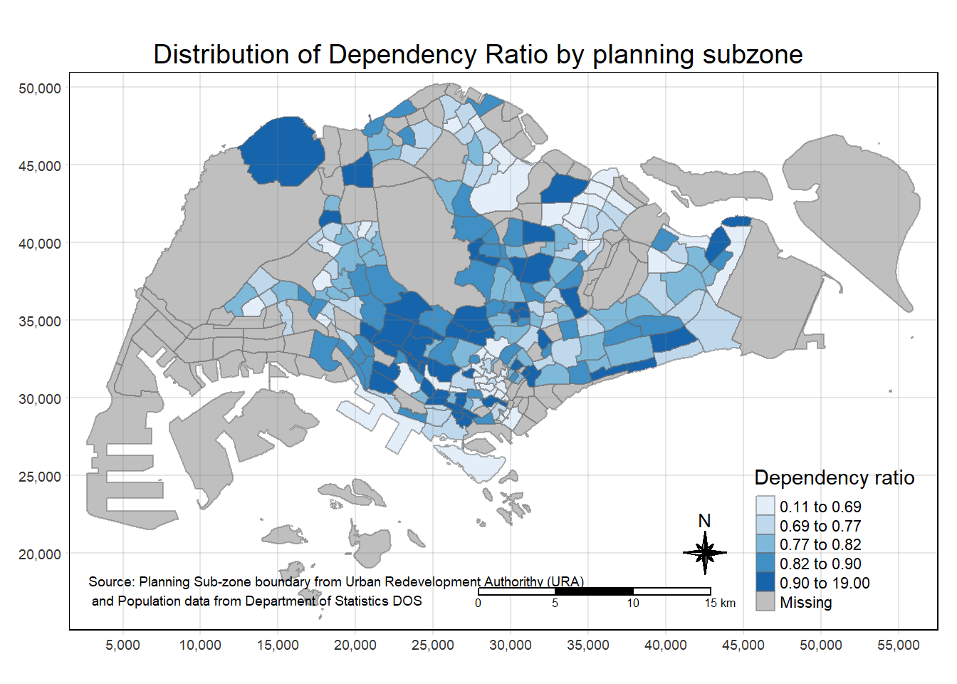
3.2.1 Drawing a base map
Let’s see how the map above is plotted step-by-step.
First, we create a base map.
tm_shape(mpsz_pop2020) +
  tm_polygons()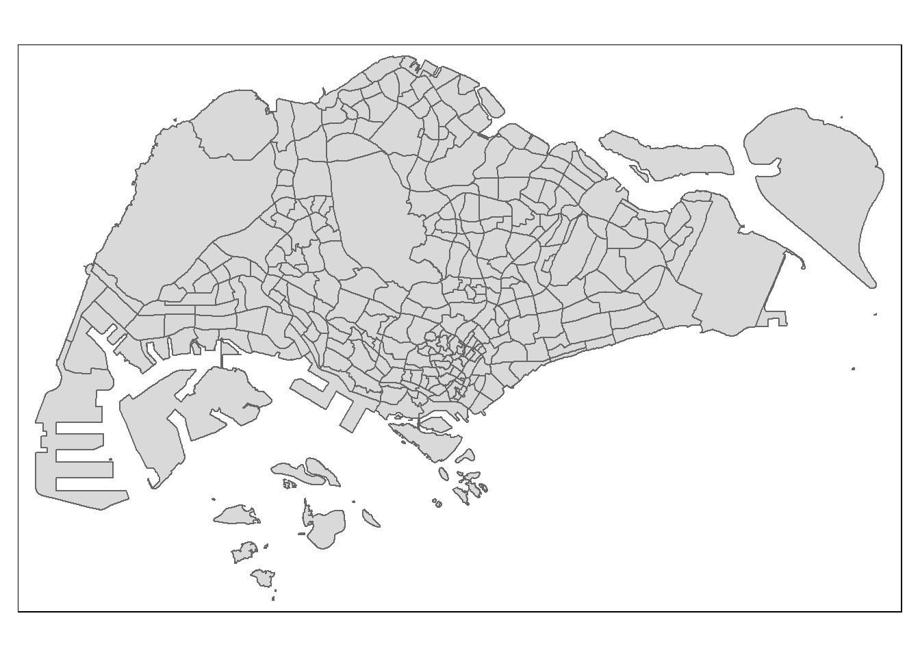
3.2.2 Drawing a choropleth map using tm_polygons()
Fill the color by indicating the fill variable.
tm_shape(mpsz_pop2020) +
  tm_polygons("DEPENDENCY")
3.2.3 Drawing a choropleth map using tm_fill() and tm_border()
We remove the border of the polygons by change tm_polygons() to tm_fill().
tm_shape(mpsz_pop2020) +
  tm_fill("DEPENDENCY")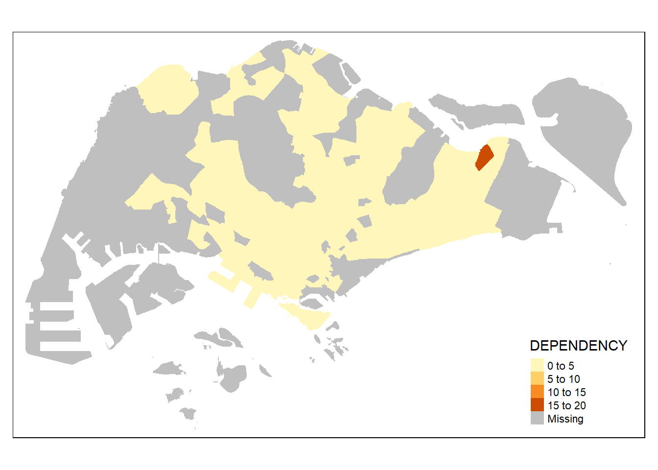
We then add the boundaries back with customization.
tm_shape(mpsz_pop2020) +
  tm_fill("DEPENDENCY") +
  tm_borders(lwd = 0.1,  alpha = 1)
3.2.4 Data classification methods of tmap
Most choropleth maps employ some methods of data classification. The point of classification is to take a large number of observations and group them into data ranges or classes.
tmap provides a total ten data classification methods, namely: fixed, sd, equal, pretty (default), quantile, kmeans, hclust, bclust, fisher, and jenks.
Let’s first see how built-in classification methods look like.
tm_shape(mpsz_pop2020) +
  tm_fill("DEPENDENCY",
          n = 5,
          style = "jenks") +
  tm_borders(alpha = 0.5)
Compare to equal data classification method.
tm_shape(mpsz_pop2020) +
  tm_fill("DEPENDENCY",
          n = 5,
          style = "equal") +
  tm_borders(alpha = 0.5)
Notice that we can’t really see the differences in dependency ratio when the values are classified with a equal distance. Therefore, the quantile data classification method is better in this case.
In addition to the standard data classification methods provided, we can also customize our own classification methods.
summary(mpsz_pop2020$DEPENDENCY) Min. 1st Qu. Median Mean 3rd Qu. Max. NA's
0.1111 0.7147 0.7866 0.8585 0.8763 19.0000 92 tm_shape(mpsz_pop2020) +
tm_fill("DEPENDENCY",
breaks = c(0, 0.60, 0.70, 0.80, 0.90, 1.00)) +
tm_borders(alpha = 0.5)Warning: Values have found that are higher than the highest break
3.2.5 Colour Scheme
Let’s now change to another color scheme.
tm_shape(mpsz_pop2020) +
  tm_fill("DEPENDENCY",
          n = 6,
          style = "quantile",
          palette = "Blues") +
  tm_borders(alpha = 0.5)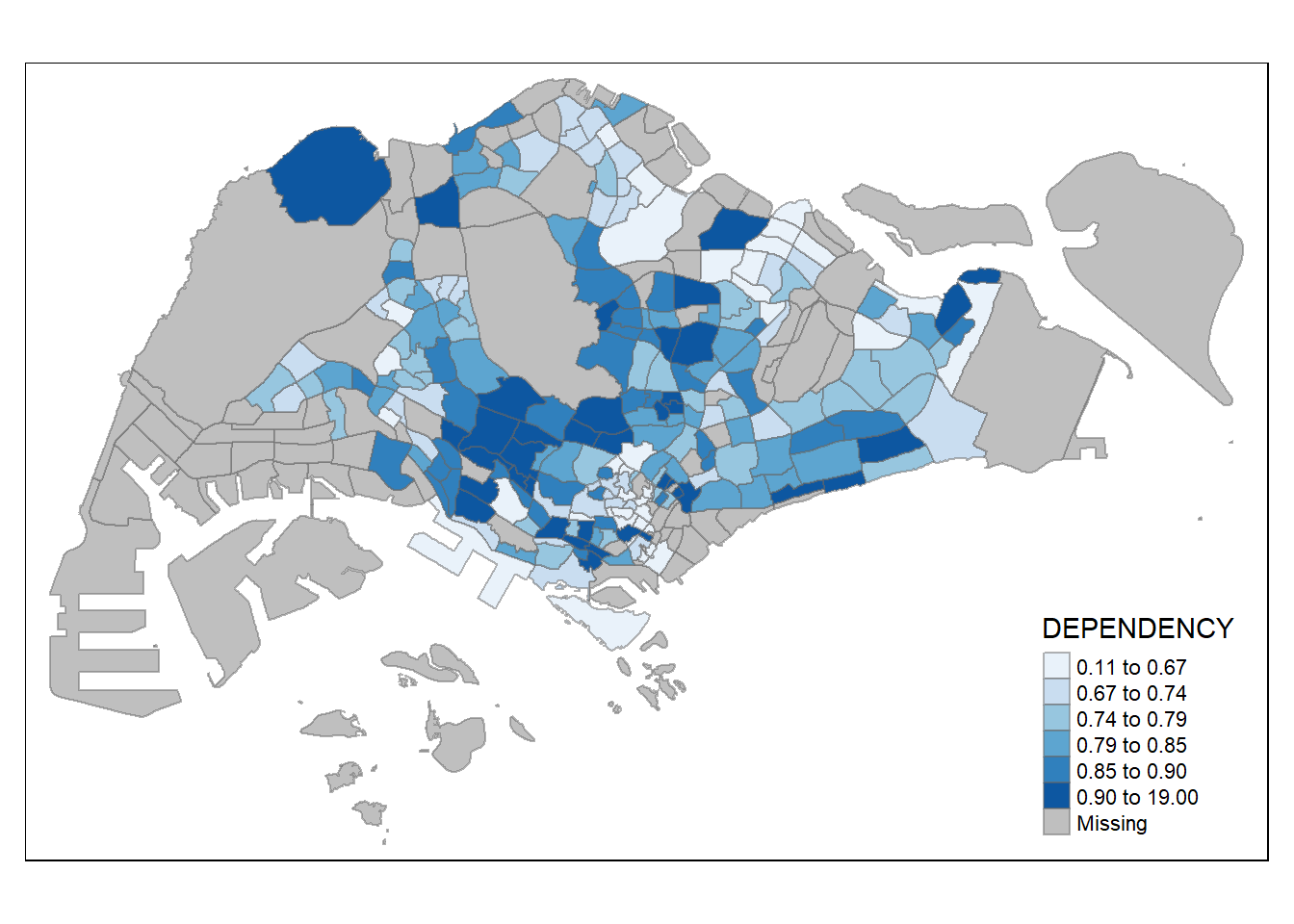
We can also reverse the color shading.
tm_shape(mpsz_pop2020) +
  tm_fill("DEPENDENCY",
          n = 6,
          style = "quantile",
          palette = "-Blues") +
  tm_borders(alpha = 0.5)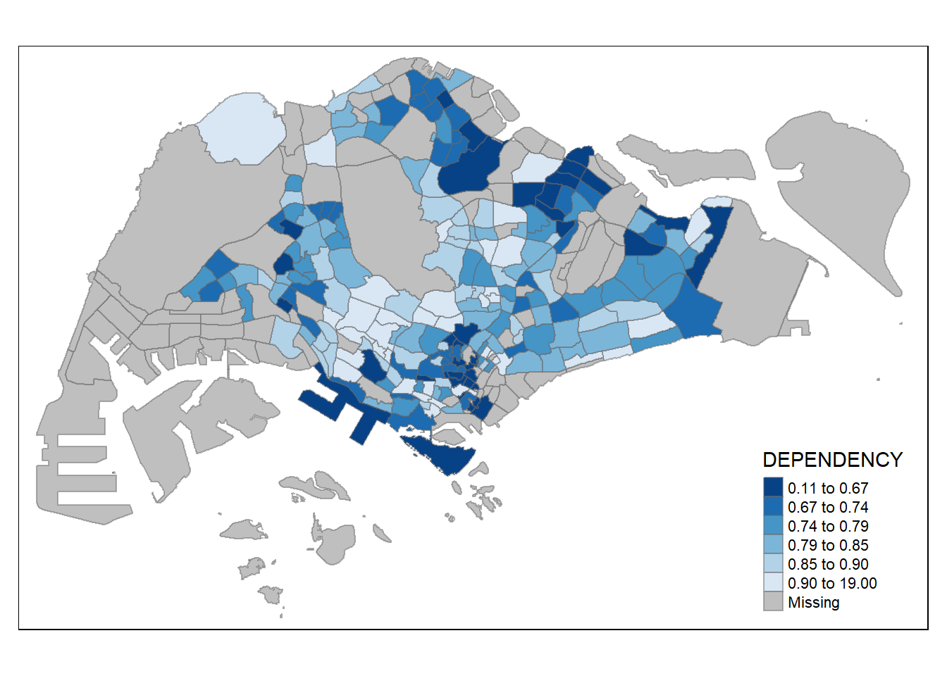
3.2.6 Map Layouts
Ledend and title can be added on the maps using the code below.
tm_shape(mpsz_pop2020) +
  tm_fill("DEPENDENCY",
          style = "jenks",
          palette = "Blues",
          legend.hist = TRUE,
          legend.is.portrait = TRUE,
          legend.hist.z = 0.1) +
  tm_layout(main.title = "Distribution of Dependency Ratio by planning subzone \n(Jenks classification)",
            main.title.position = "center",
            main.title.size = 1,
            legend.height = 0.45,
            legend.width = 0.35,
            legend.outside = FALSE,
            legend.position = c("right", "bottom"),
            frame = FALSE) +
  tm_borders(alpha = 0.5)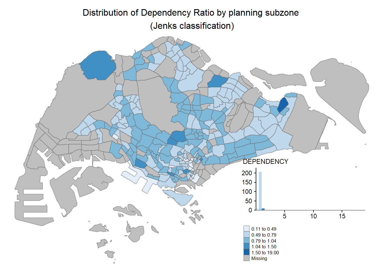
We can also customize the map style using the code below.
tm_shape(mpsz_pop2020) +
  tm_fill("DEPENDENCY",
          style = "quantile",
          palette = "-Greens") +
  tm_borders(alpha = 0.5) +
  tmap_style("classic")
tmap style set to "classic"other available styles are: "white", "gray", "natural", "cobalt", "col_blind", "albatross", "beaver", "bw", "watercolor" 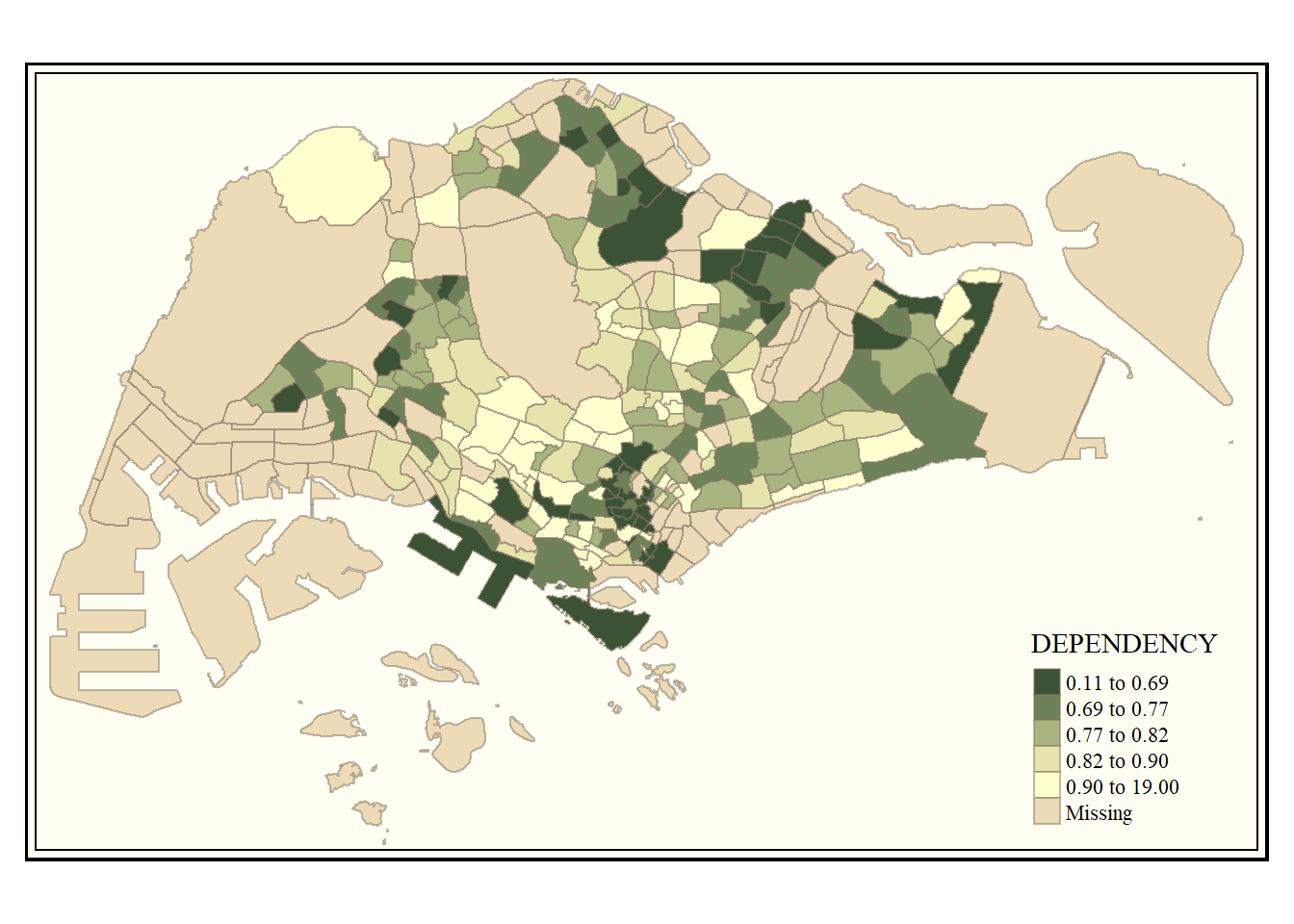
We can also draw other map furniture such as compass, scale bar and grid lines.
tm_shape(mpsz_pop2020) +
  tm_fill("DEPENDENCY",
          style = "quantile",
          palette = "Blues",
          title = "No. of persons") +
  tm_layout(main.title = "Distribution of Dependency Ratio \nby planning subzone",
            main.title.position = "center",
            main.title.size = 1.2,
            legend.height = 0.45,
            legend.width = 0.35,
            frame = TRUE) +
  tm_borders(alpha = 0.5) +
  tm_compass(type = "8star", size = 2) +
  tm_scale_bar(width = 0.15) +
  tm_grid(lwd = 0.1, alpha = 0.2) +
  tm_credits("Source: Planning Sub-zone boundary from Urban Redevelopment Authorithy (URA)\n and Population data from Department of Statistics DOS",
             position = c("left", "bottom"))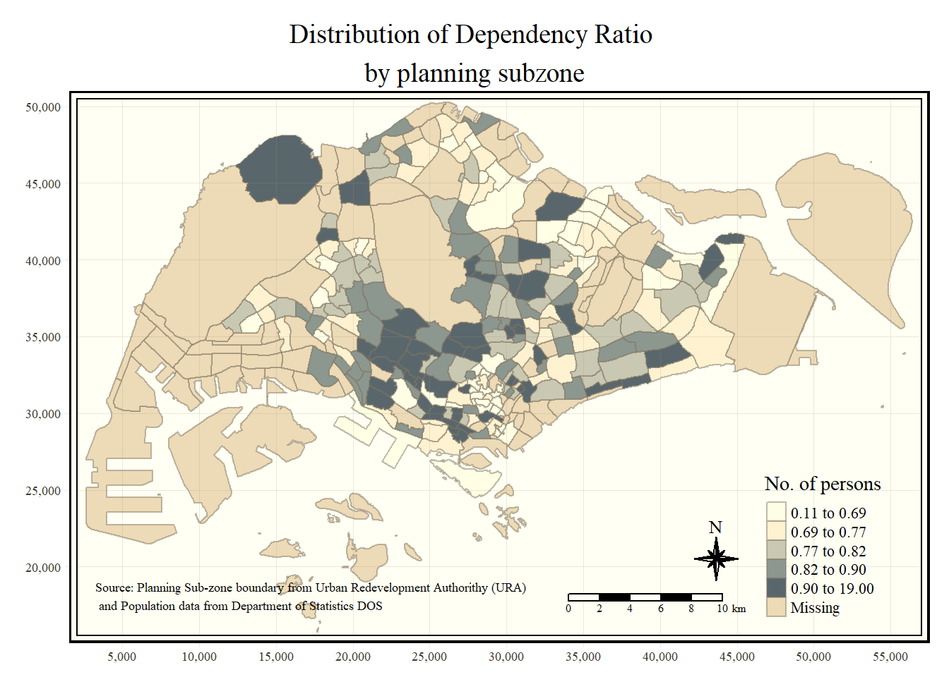
3.3 Drawing Small Multiple Choropleth Maps
We can also draw mutiple choropleth maps for different variables.
tm_shape(mpsz_pop2020) +
  tm_fill(c("YOUNG", "AGED"),
          style = "equal",
          palette = "Blues") +
  tm_layout(legend.position = c("right", "bottom")) +
  tm_borders(alpha = 0.5) +
  tmap_style("white")
tmap style set to "white"other available styles are: "gray", "natural", "cobalt", "col_blind", "albatross", "beaver", "bw", "classic", "watercolor" 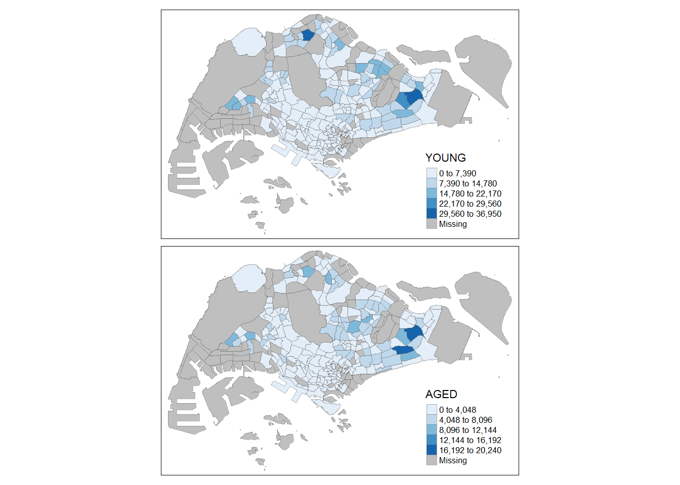
We can also customize each choropleth map using the code below.
tm_shape(mpsz_pop2020) +
  tm_polygons(c("DEPENDENCY","AGED"),
          style = c("equal", "quantile"),
          palette = list("Blues", "Greens")) +
  tm_layout(legend.position = c("right", "bottom"))
In addition, we can draw different choropleth maps by different categories.
tm_shape(mpsz_pop2020) +
  tm_fill("DEPENDENCY",
          style = "quantile",
          palette = "Blues",
          thres.poly = 0) +
  tm_facets(by = "REGION_N",
            free.coords = TRUE,
            drop.shapes = FALSE) +
  tm_layout(legend.show = FALSE,
            title.position = c("center", "center"),
            title.size = 20) +
  tm_borders(alpha = 0.5)
Warning: The argument drop.shapes has been renamed to drop.units, and is
therefore deprecated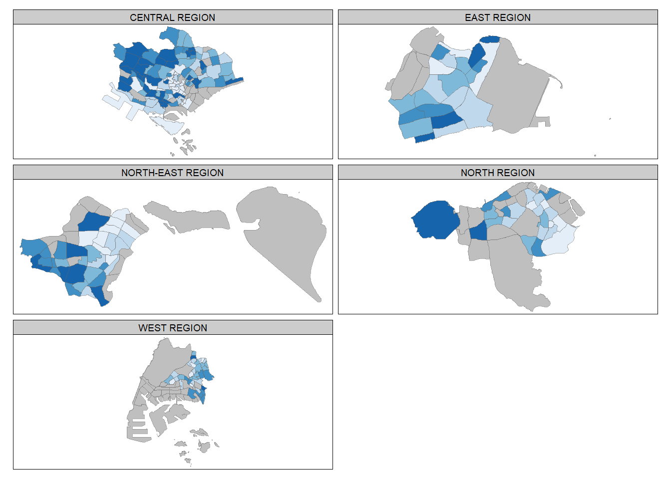
Or we can arrange them in the way we want.
youngmap <- tm_shape(mpsz_pop2020) +
  tm_polygons("YOUNG",
              style = "quantile",
              palette = "Blues")

agedmap <- tm_shape(mpsz_pop2020) +
  tm_polygons("AGED",
              style = "quantile",
              palette = "Blues")

tmap_arrange(youngmap, agedmap, asp=1, ncol=2)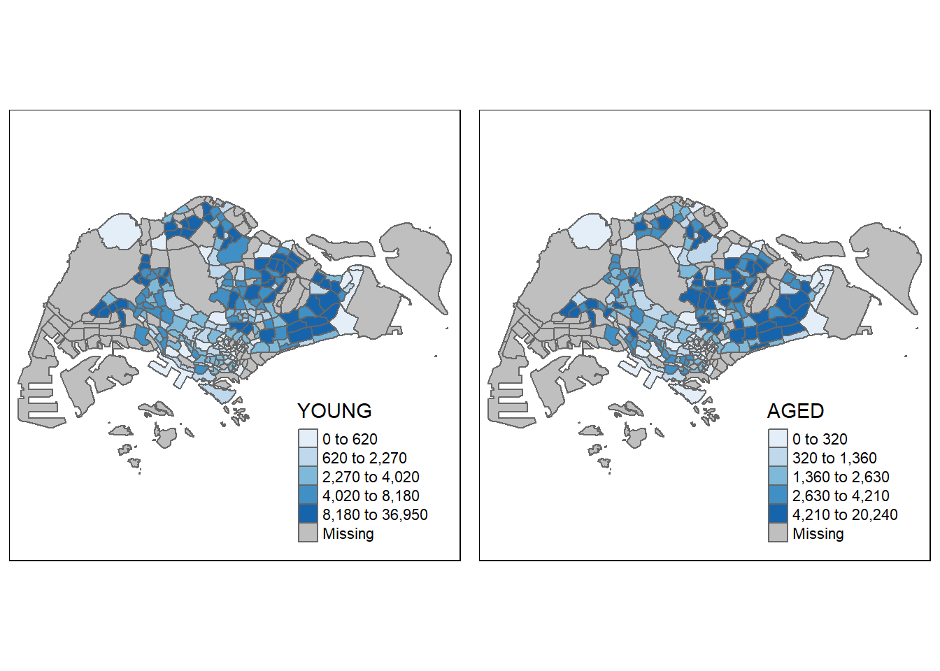
3.4 Mappping Spatial Object Meeting a Selection Criterion
Instead of creating small multiple choropleth map, we can also use selection function to map spatial objects meeting the selection criterion.
tm_shape(mpsz_pop2020[mpsz_pop2020$REGION_N == "CENTRAL REGION", ])+
  tm_fill("DEPENDENCY",
          style = "quantile",
          palette = "Blues",
          legend.hist = TRUE,
          legend.is.portrait = TRUE,
          legend.hist.z = 0.1) +
  tm_layout(legend.outside = TRUE,
            legend.height = 0.45,
            legend.width = 5.0,
            legend.position = c("right", "bottom"),
            frame = FALSE) +
  tm_borders(alpha = 0.5)
Warning in pre_process_gt(x, interactive = interactive, orig_crs =
gm$shape.orig_crs): legend.width controls the width of the legend within a map.
Please use legend.outside.size to control the width of the outside legend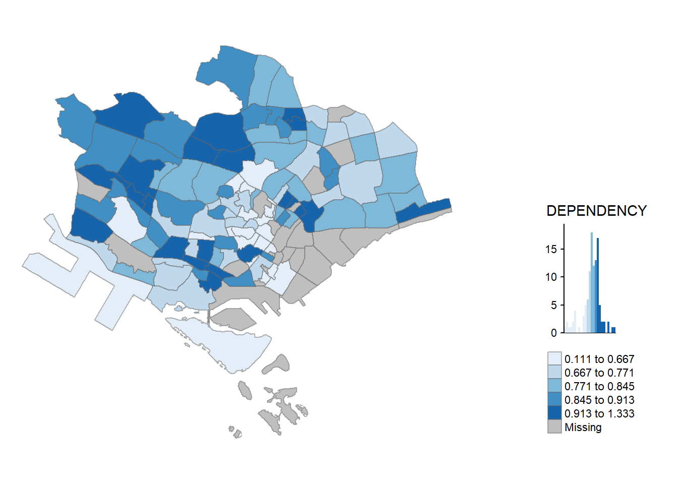
This comes to the end of this hands-on exercise. I have learned to plot choropleth maps using geospatial and attribute data in R. Hope you enjoyed it, too!
See you in the next hands-on exercise 🥰