pacman::p_load(tidyverse, sf, tmap)Analytical Mapping
1. Learning Outcome
In this hands-on exercise, we will learn how to analytical maps in R.
2. Getting Started
2.1 Installing and loading the required libraries
Firstly, let’s install and load the required packages:
tidyverse: an opinionated collection of R packages designed for data import, data wrangling and data exploration
sf: a standardized way to encode spatial vector data.
tmap: makes it easier to plot thematic maps.
2.2 Importing the data
In this exercise, we will use a prepared data set called NGA_wp.rds. The data set is a polygon feature data.frame providing information on water point of Nigeria at the LGA level.
Let’s start by importing the data.
NGA_wp <- read_rds("../../Data/hands-on_ex07/rds/NGA_wp.rds")3. Basic Choropleth Mapping
3.1 Visualising distribution of non-functional water point
First, we plot a choropleth map showing the distribution of non-function water point by LGA.
p1 <- tm_shape(NGA_wp) +
  tm_fill("wp_functional",
          n = 10,
          style = "equal",
          palette = "Blues") +
  tm_borders(lwd = 0.1,
             alpha = 1) +
  tm_layout(main.title = "Distribution of functional water point by LGAs",
            legend.outside = FALSE)
p2 <- tm_shape(NGA_wp) +
tm_fill("total_wp",
n = 10,
style = "equal",
palette = "Blues") +
tm_borders(lwd = 0.1,
alpha = 1) +
tm_layout(main.title = "Distribution of total water point by LGAs",
legend.outside = FALSE)tmap_arrange(p2, p1, nrow = 1)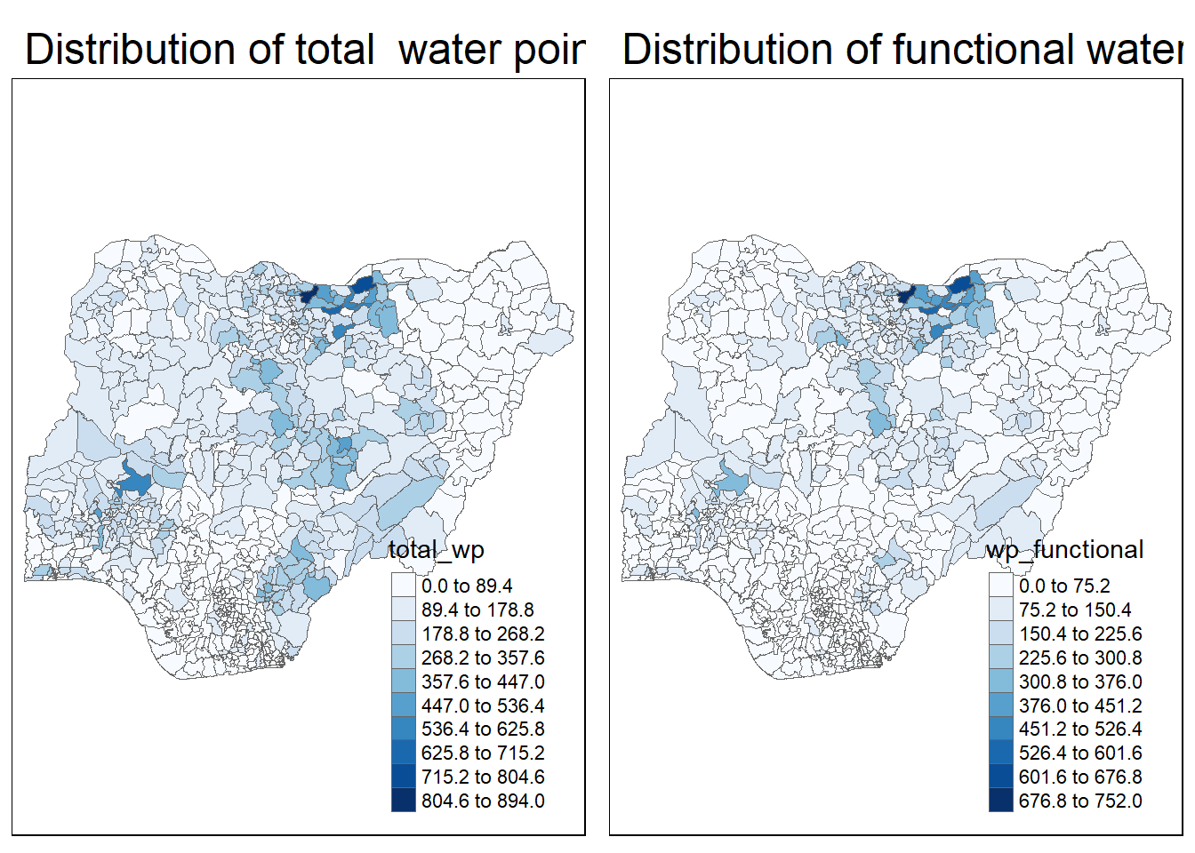
The plots above shows which region have more water points, and which region have more functional water points.
However, some times the number of functional water points could be mis-leading if we want to know which region has maintained the water points better, because the region have more water points would have more functional water points in general.
Therefore, the analysis of rates would come in handy in such scenarios.
4.Choropleth Map for Rates
4.1 Deriving Proportion of Functional Water Points and Non-Functional Water Points
We first calculate the percentage of functional and non-functional water points for each region.
NGA_wp <- NGA_wp %>%
  mutate(pct_functional = wp_functional/total_wp) %>%
  mutate(pct_nonfunctional = wp_nonfunctional/total_wp)
Plotting map of rate
tm_shape(NGA_wp) +
  tm_fill("pct_functional",
          n = 10,
          style = "equal",
          palette = "Blues",
          legend.hist = TRUE) +
  tm_borders(lwd = 0.1,
             alpha = 1) +
  tm_layout(main.title = "Rate map of functional water point by LGAs",
            legend.outside = TRUE)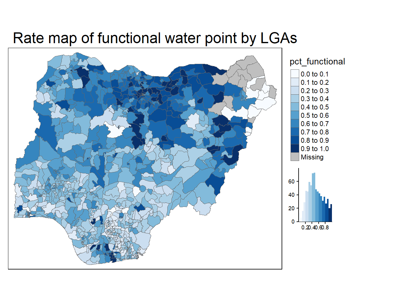
Now the intensiveness of the color indicates the percentage of functional water points in each region. The darker the color is, the higher the percentage is.
5. Extreme Value Maps
Extreme value maps are variations of common choropleth maps where the classification is designed to highlight extreme values at the lower and upper end of the scale, with the goal of identifying outliers.
5.1 Percentile Map
The percentile map is a special type of quantile map with six specific categories: 0-1%,1-10%, 10-50%,50-90%,90-99%, and 99-100%. The corresponding breakpoints can be derived by means of the base R quantile command, passing an explicit vector of cumulative probabilities as c(0,.01,.1,.5,.9,.99,1). Note that the begin and endpoint need to be included.
5.1.1 Data Preparation
Step 1: Exclude records with NA by using the code chunk below.
NGA_wp <- NGA_wp %>%
  drop_na()
Step 2: Creating customised classification and extracting values
percent <- c(0, 0.01, 0.1, 0.5, 0.9, 0.99, 1)
var <- NGA_wp["pct_functional"] %>%
  st_set_geometry(NULL)
quantile(var[,1], percent)
0% 1% 10% 50% 90% 99% 100%
0.0000000 0.0000000 0.2169811 0.4791667 0.8611111 1.0000000 1.0000000 5.1.2 Creating the get.var function
Firstly, we will write an R function as shown below to extract a variable (i.e. wp_nonfunctional) as a vector out of an sf data.frame.
get.var <- function(vname, df) {
  v <- df[vname] %>%
    st_set_geometry(NULL)
  v <- unname(v[,1])
  return(v)
}
5.1.3 A percentile mapping function
Next, we will write a percentile mapping function by using the code chunk below.
percentmap <- function(vnam, df, legtitle=NA, mtitle="Percentile Map"){
  percent <- c(0,.01,.1,.5,.9,.99,1)
  var <- get.var(vnam, df)
  bperc <- quantile(var, percent)
  tm_shape(df) +
  tm_polygons() +
  tm_shape(df) +
     tm_fill(vnam,
             title=legtitle,
             breaks=bperc,
             palette="Blues",
          labels=c("< 1%", "1% - 10%", "10% - 50%", "50% - 90%", "90% - 99%", "> 99%"))  +
  tm_borders() +
  tm_layout(main.title = mtitle,
            title.position = c("right","bottom"))
}
5.1.4 Test drive the percentile mapping function
percentmap("total_wp", NGA_wp)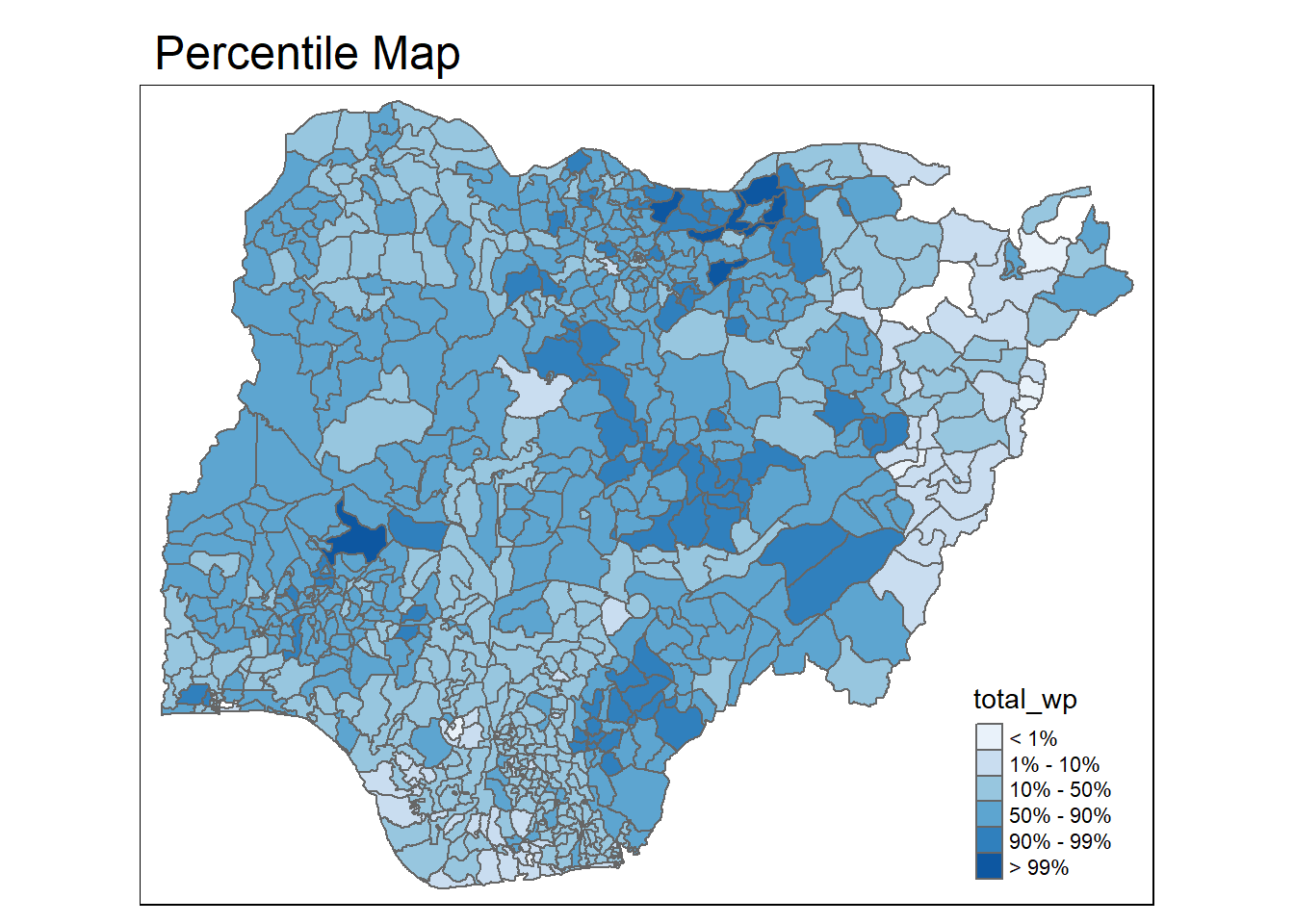
Now the color is distributed based on the percentile we have specified.
5.2 Box map
A box map is an augmented quartile map, with an additional lower and upper category. When there are lower outliers, then the starting point for the breaks is the minimum value, and the second break is the lower fence. In contrast, when there are no lower outliers, then the starting point for the breaks will be the lower fence, and the second break is the minimum value (there will be no observations that fall in the interval between the lower fence and the minimum value).
ggplot(data = NGA_wp,
       aes(x = "",
           y = wp_nonfunctional)) +
  geom_boxplot()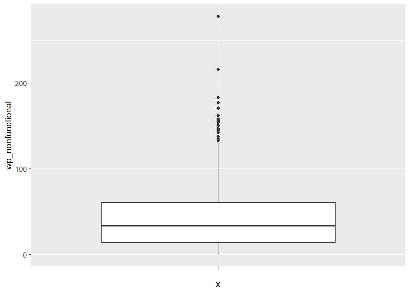
5.2.1 Creating the boxbreaks function
The code chunk below is an R function that creating break points for a box map.
- arguments:
- v: vector with observations
- mult: multiplier for IQR (default 1.5)
- returns:
- bb: vector with 7 break points compute quartile and fences
boxbreaks <- function(v,mult=1.5) {
  qv <- unname(quantile(v))
  iqr <- qv[4] - qv[2]
  upfence <- qv[4] + mult * iqr
  lofence <- qv[2] - mult * iqr
  # initialize break points vector
  bb <- vector(mode="numeric",length=7)
  # logic for lower and upper fences
  if (lofence < qv[1]) {  # no lower outliers
    bb[1] <- lofence
    bb[2] <- floor(qv[1])
  } else {
    bb[2] <- lofence
    bb[1] <- qv[1]
  }
  if (upfence > qv[5]) { # no upper outliers
    bb[7] <- upfence
    bb[6] <- ceiling(qv[5])
  } else {
    bb[6] <- upfence
    bb[7] <- qv[5]
  }
  bb[3:5] <- qv[2:4]
  return(bb)
}
5.2.2 Creating the get.var function
The code chunk below is an R function to extract a variable as a vector out of an sf data frame.
- arguments:
- vname: variable name (as character, in quotes)
- df: name of sf data frame
- returns:
- v: vector with values (without a column name)
get.var <- function(vname,df) {
  v <- df[vname] %>% st_set_geometry(NULL)
  v <- unname(v[,1])
  return(v)
}
5.2.3 Test drive the newly created function
var <- get.var("wp_nonfunctional", NGA_wp)
boxbreaks(var)
[1] -56.5 0.0 14.0 34.0 61.0 131.5 278.05.2.4 Boxmap function
boxmap <- function(vnam, df,
                   legtitle=NA,
                   mtitle="Box Map",
                   mult=1.5){
  var <- get.var(vnam,df)
  bb <- boxbreaks(var)
  tm_shape(df) +
    tm_polygons() +
  tm_shape(df) +
     tm_fill(vnam,title=legtitle,
             breaks=bb,
             palette="Blues",
          labels = c("lower outlier",
                     "< 25%",
                     "25% - 50%",
                     "50% - 75%",
                     "> 75%",
                     "upper outlier"))  +
  tm_borders() +
  tm_layout(main.title = mtitle,
            title.position = c("left",
                               "top"))
}tmap_mode("plot")tmap mode set to plottingboxmap("wp_nonfunctional", NGA_wp)Warning: Breaks contains positive and negative values. Better is to use
diverging scale instead, or set auto.palette.mapping to FALSE.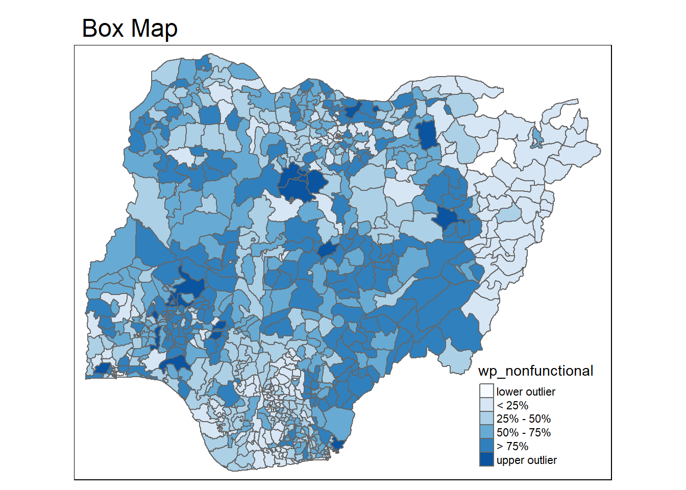
Now the lightest color and the darkest color indicates the outliers on the map.
This comes to the end of this hands-on exercise. I have learned to plot analytical maps using R. Hope you enjoyed it, too!
See you in the next hands-on exercise 🥰